Why is Kantree the best alternative to Monday?

Complete Guide [October 24]
You’re reading this article because you’re probably thinking about a new organizational tool. You’ve likely searched for the “best project management tool” and noticed that Monday.com is often mentioned. Indeed, it’s a popular solution that’s often used to get started. However, popular solutions like Monday often reach their limits when it comes to projects requiring more complexity or as the team grows in size. In this context, we show in this article why alternatives like Kantree are better suited for you. We analyze in depth the features of these two project management software to help you make the choice that best fits your team.
For quick access to essential categories for any agile project management software, click on the tested categories:
- Kantree Overview
- Monday.com Overview
- Cards and Fields Management
- Filters
- Kanban Boards and Workflow
- Work Flow Centralization
- Views and Reports
- Subcards and Hierarchy
- Forms
- UX/UI Differences
- Which Project Tool to Choose Finally?
Kantree: the flexible alternative for all types of projects
Its history
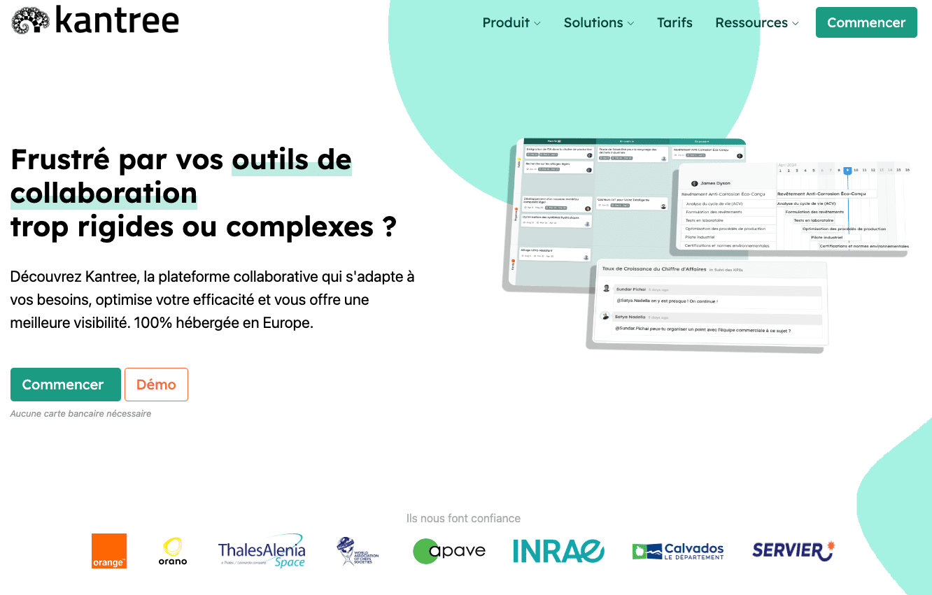
Kantree is a project management software that enables easy collaboration on missions and improves team productivity and work visibility. It offers the ability to share tasks, manage project evolution in real-time, and execute customized processes. Kantree was created in 2016 and was born from the observation of the multiplicity and complexity of the collaborative platform market. Kantree is a product managed by Digicoop, a French employee cooperative.
Kantree’s advantages:
- Completely modular card structure
- Advanced process and workflow customization
- Powerful filters with KQL language
- Precise adaptation to complex organizational needs
Monday.com: the established choice for simple projects
Its history
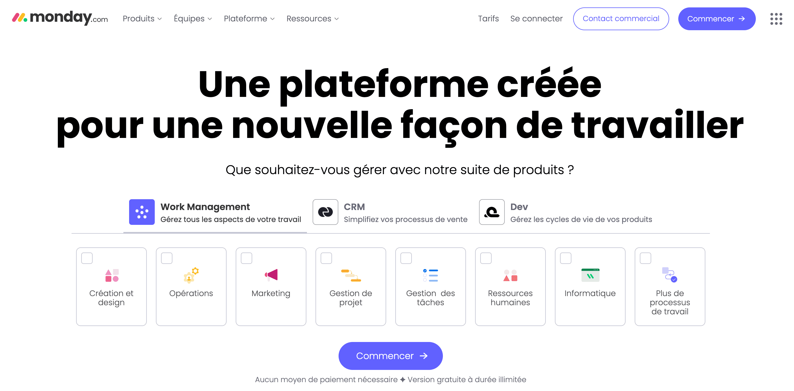
Monday is software that was developed in 2012 in Tel Aviv, Israel. Initially as a Wix company project, the company’s focus was centralizing communications around boards. Monday.com has now evolved into a complete tool for task management and more broadly, project tracking. Today, Monday.com is listed on the Nasdaq since June 10, 2021, after raising $574 million.
Monday’s advantages:
- Animated user interface
- Ease of use for standard project management
- Relevant for teams prioritizing visual aspect
Feature comparison: Monday vs Kantree
Cards and fields management
Monday offers a predefined structure with limited fields, while Kantree offers total customization of cards and fields.
Cards in Monday
When clicking on a board element, its details open. To add a field, this can only be done according to the predefined gallery in the application. When adding an element, it adds at the tab level. Therefore, you need to navigate through different tabs to find the information you’re looking for.
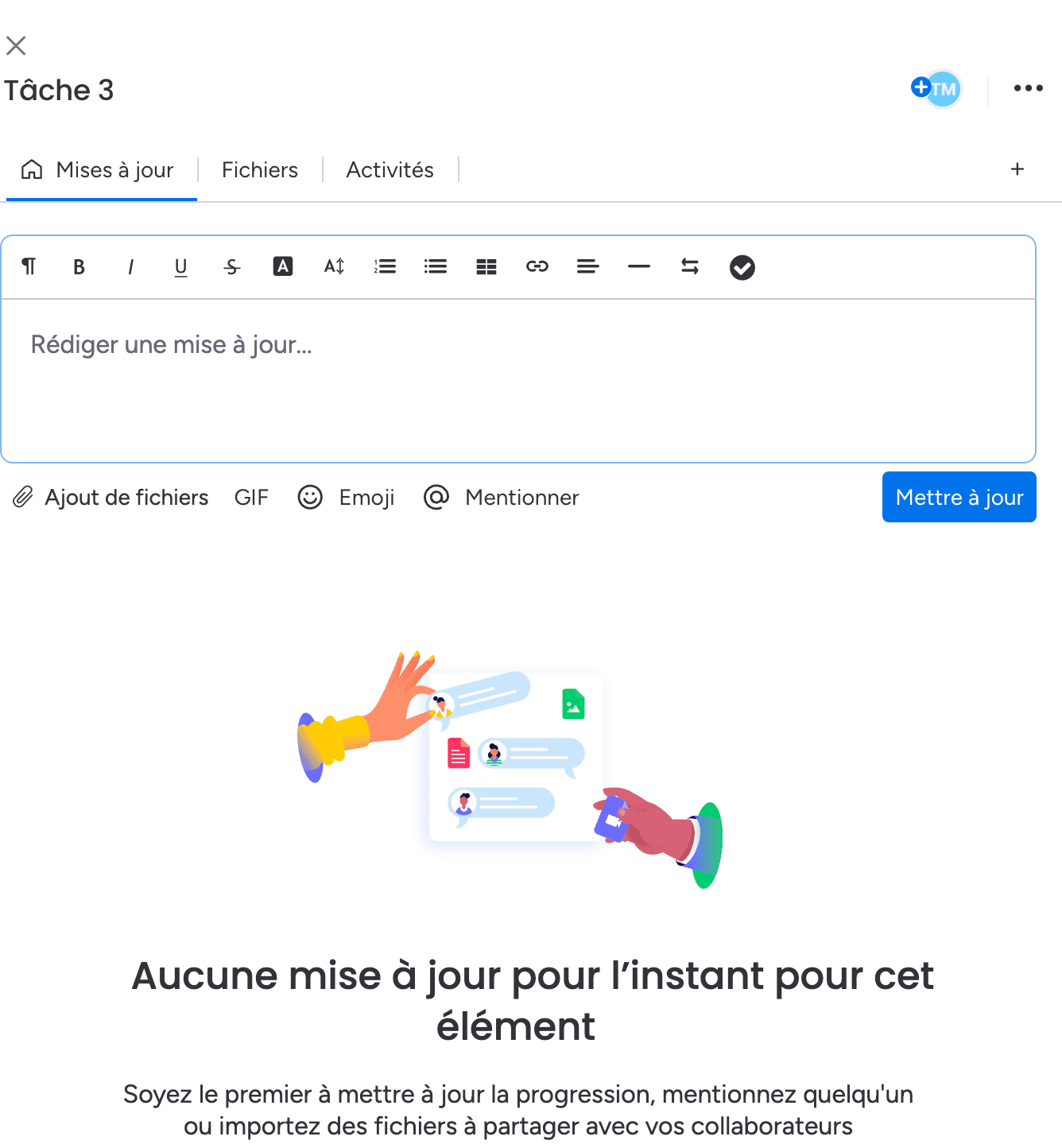 Field creation is limited
Cards in Kantree
When clicking on an element to open its details, you immediately see that you’re opening a card that represents itself as a structured mini document. Fields are added as needed and arranged at will, both in substance and form. Cards are modular and information is centralized 360° on these cards.
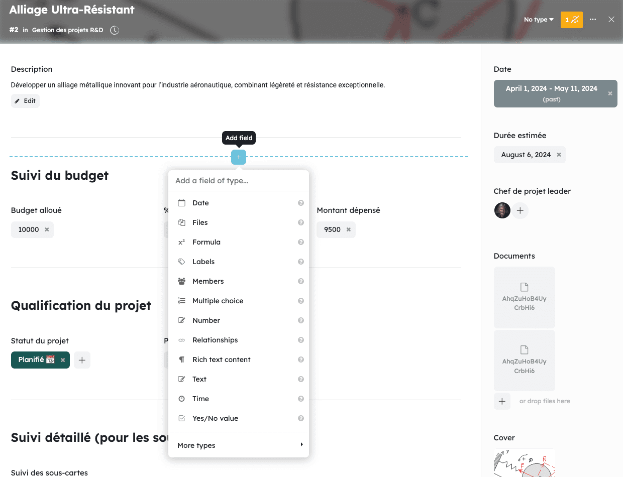 More than 27 fields available by clicking anywhere on the card
Filters
Monday distinguishes itself with simple filters, while Kantree has advanced filters using KQL language.
Filters in Monday
Filters are presented as checkboxes by default. There is the possibility to opt for advanced filters which correspond only to adding “and” and “or” conditions in the filter editor.
 The filter editor in Monday
Filters in Kantree
The default filter in Kantree corresponds to Monday’s advanced filter. Advanced filters in Kantree are more precise and powerful, allowing the possibility to freely write desired conditions thanks to the use of KQL language. These filters are moreover present at all levels, whether on views, reports, automations,… KQL can be used everywhere for advanced filter customization.
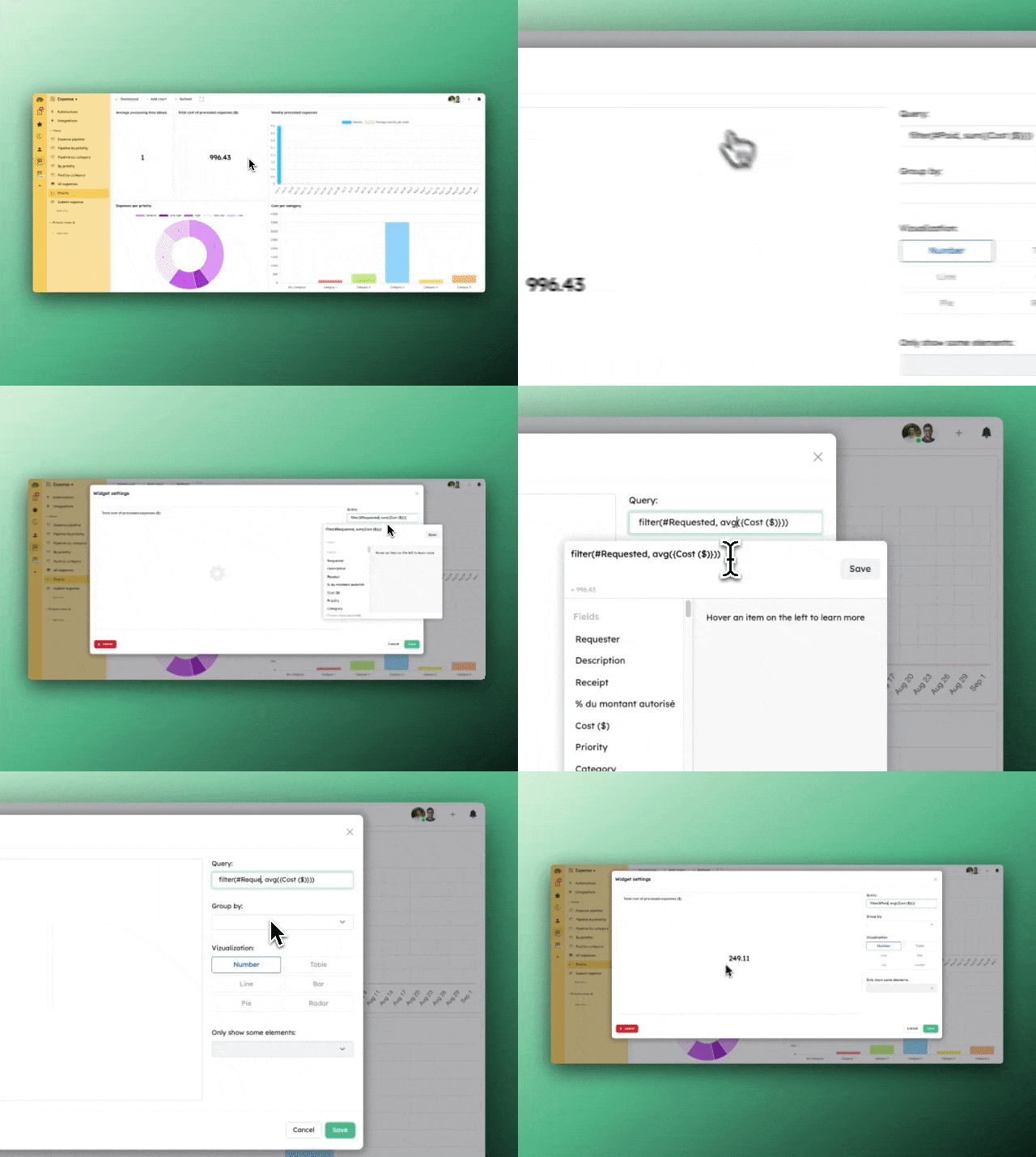 In addition to classic filtering like Monday, KQL allows going further in information refinement
Kanban boards and workflow
Kantree enables complex Kanban boards and advanced workflows, unlike Monday which offers more limited options.
Kanban board in Monday
When creating a Kanban board, the available screen view is limited to 3 visible tasks when adding an image to a card for example. It’s 4 cards if you remove the visual, out of a total of 6 cards in a column in our example with a maximum of 4 columns. The maximum number of cards that displays is therefore 4x4, 16 cards.
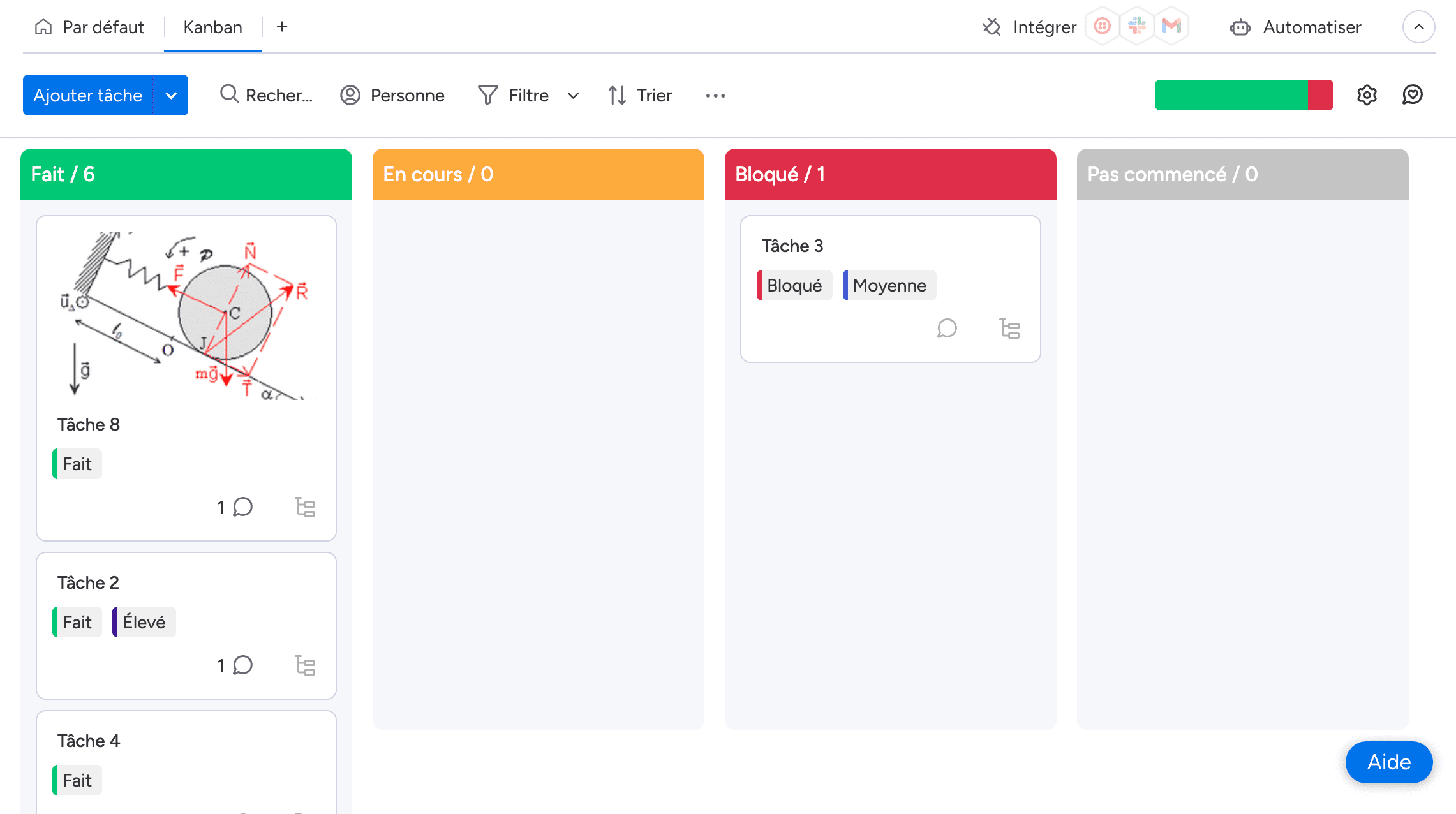 The screen quickly becomes crowded with few visible cards
Kanban board in Kantree
Kantree allows adjusting card density. Thus, taking the same example as Monday, Kantree allows displaying 7 cards on screen with a visual. For a Kanban without images, Kantree has a minimum of 8 cards per column. The Kanban view can display up to 6 columns making it possible to view 6x8 so 48 cards, 3x more than Monday.
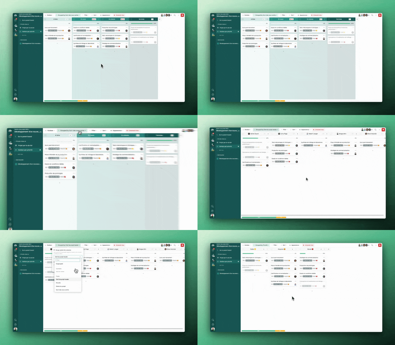 Adding photos for visual management is also possible
Work centralization
Kantree offers a more complete and customizable view of workflow compared to Monday.
Work centralization in Monday
Monday only brings up assignments in its “my work” space. Thus, even if a task creation or action is made on a card concerning us, there is no traceability. When testing a self-assignment, it doesn’t come up either.
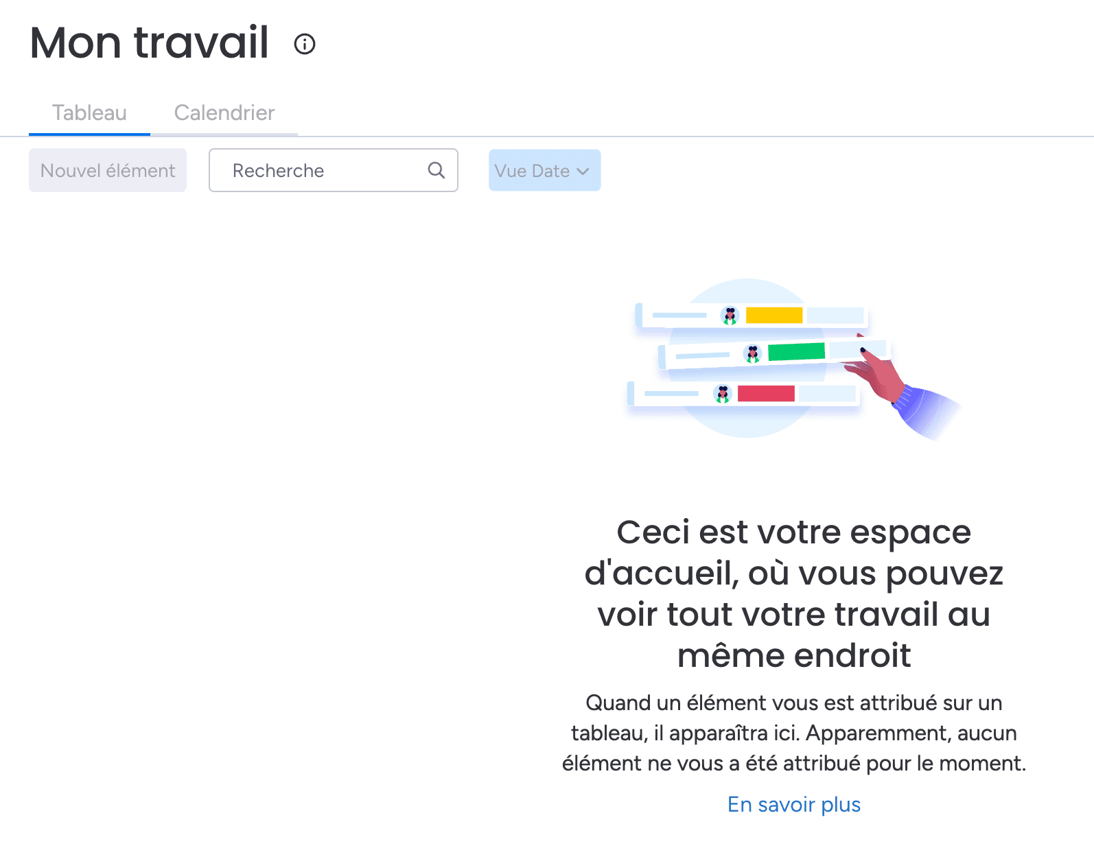
Monday’s “my work” view
Work centralization in Kantree
Kantree displays a workflow (like a social feed) because the tool allows finding updates of cards that the user follows and are centralized in the “my work” space. Some actions can be parameterized according to the user’s objective, namely the possibility to mark as “read” from the moment the person has responded to a comment.
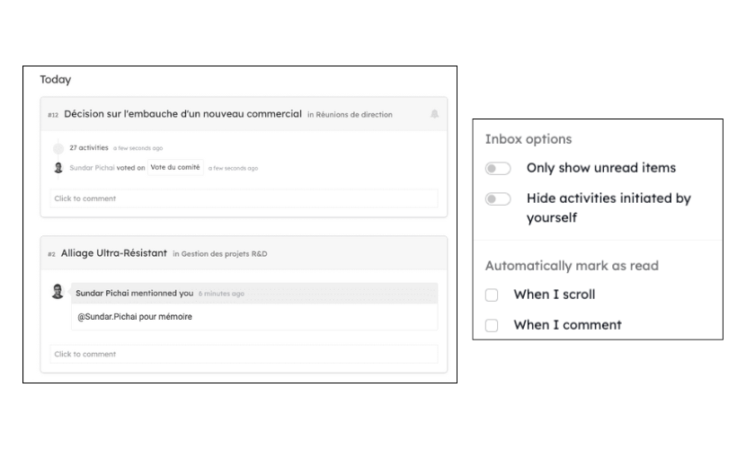
The activity feed is represented on the left while its customization is on the right
Views and reports
Monday offers standard views, while Kantree allows creating unlimited custom views with advanced filters.
Views in Monday
Monday was created and became known for its board view. This is accomplished and complete because you feel that this was the differentiating axis from the beginning. Regarding other views, they allow limited actions as seen previously with the Kanban board.
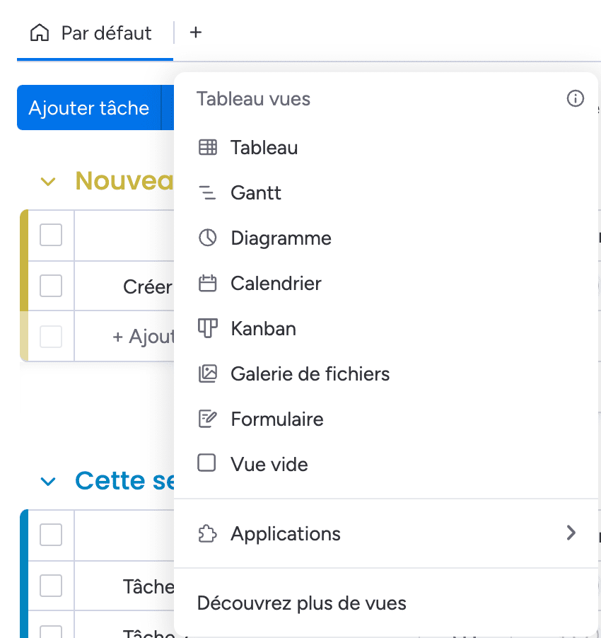 Available views in Monday
Views in Kantree
All Monday’s views are available in Kantree. The latter also has a list view like a to-do-list but also a log summary and activity journal.
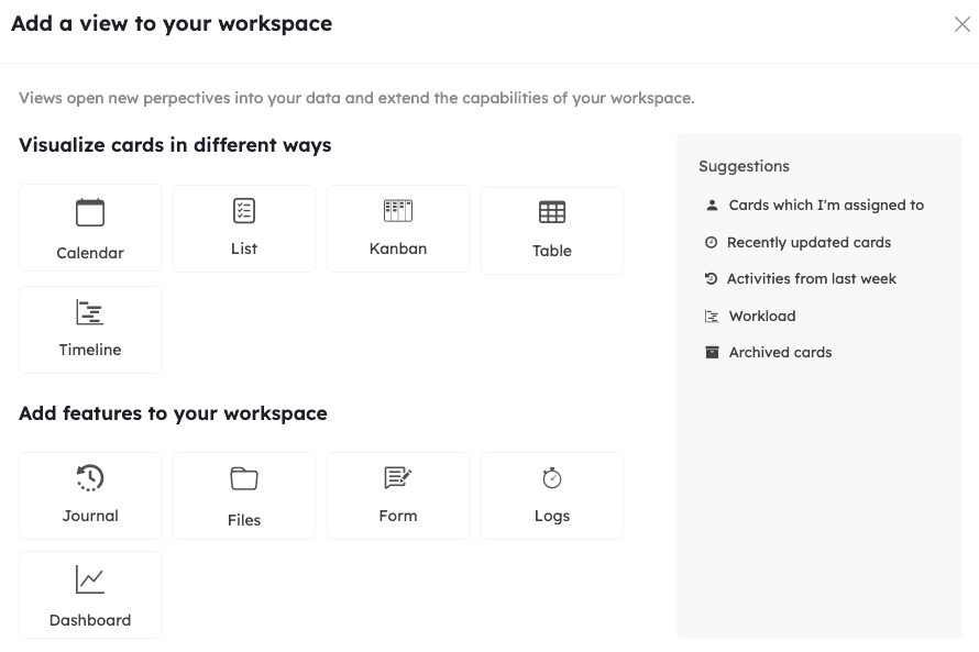 Available views in Kantree
Subcards and hierarchy
Kantree excels in subcard customization, offering better task hierarchy management.
Subcards in Monday
When creating subcards, these are found with a visual dependency link to the parent card. The information found there is that of the parent card without the possibility to remove or add fields. A subcard is the maximum state of possible granularity.
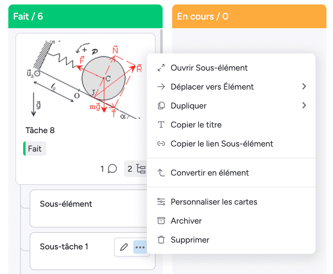 Subtask configuration is limited
Subcards in Kantree
Subcards in Kantree are themselves modular in the same way as a parent card. Thus, you can assign a specific card type to the child card to present different information while keeping this filiation link. A subcard can itself contain multiple subcards.
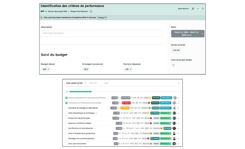 A subtask is a full card in itself, entirely configurable
Forms
Both tools offer form functionalities, but Kantree offers more customization options.
Forms in Monday
The Monday form allows adding available card fields. When sharing a public form, it’s necessary to go to the organization administrator to have the necessary authorizations.
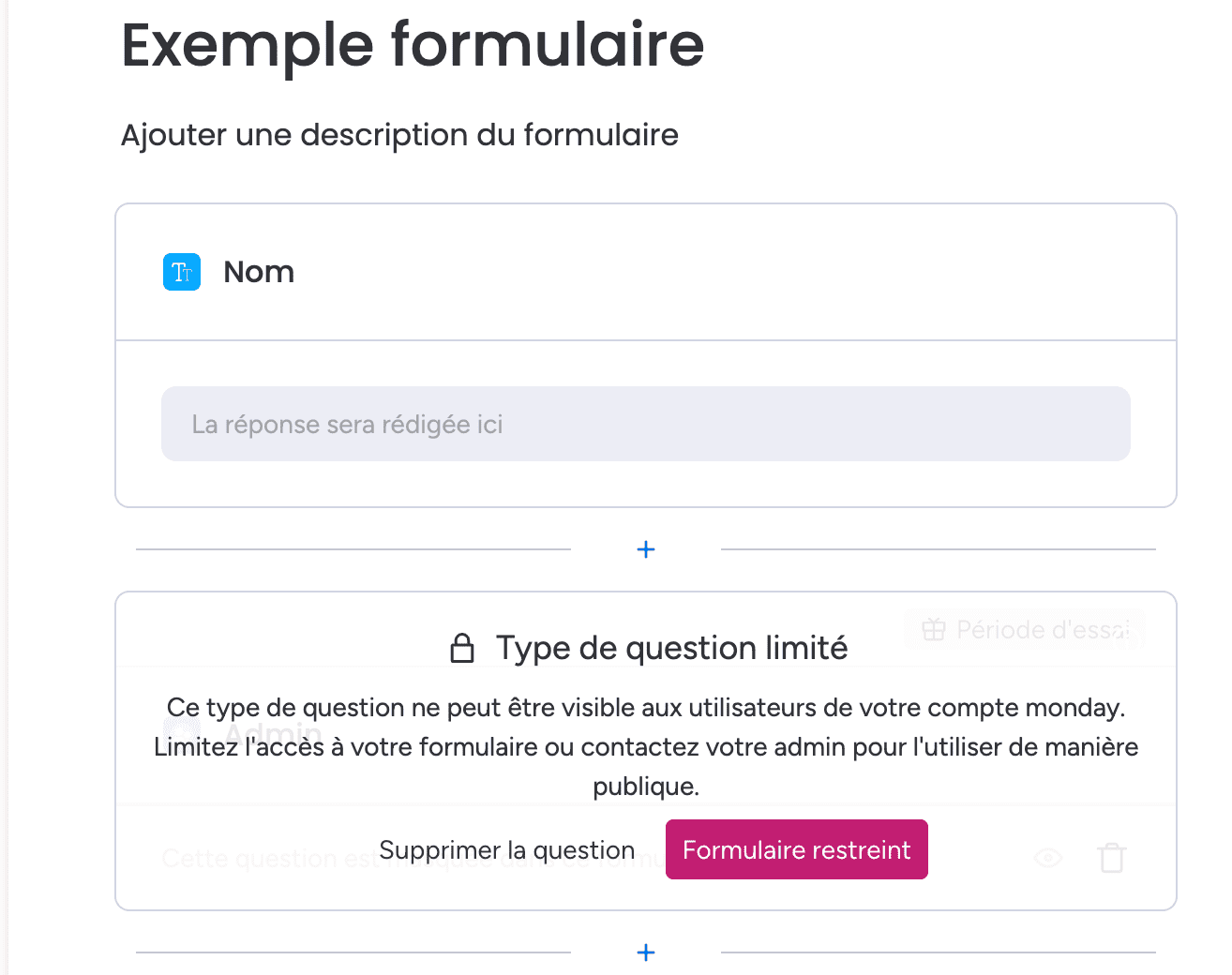 Monday’s form editor
Forms in Kantree
Kantree also has a form editor that allows creating a ready-to-share form in a few clicks. The fundamental difference here lies in the possibility of post-creation tracking, applying real-time tracking for the user who submits a form and the ability to send a message on this form after submitting it.
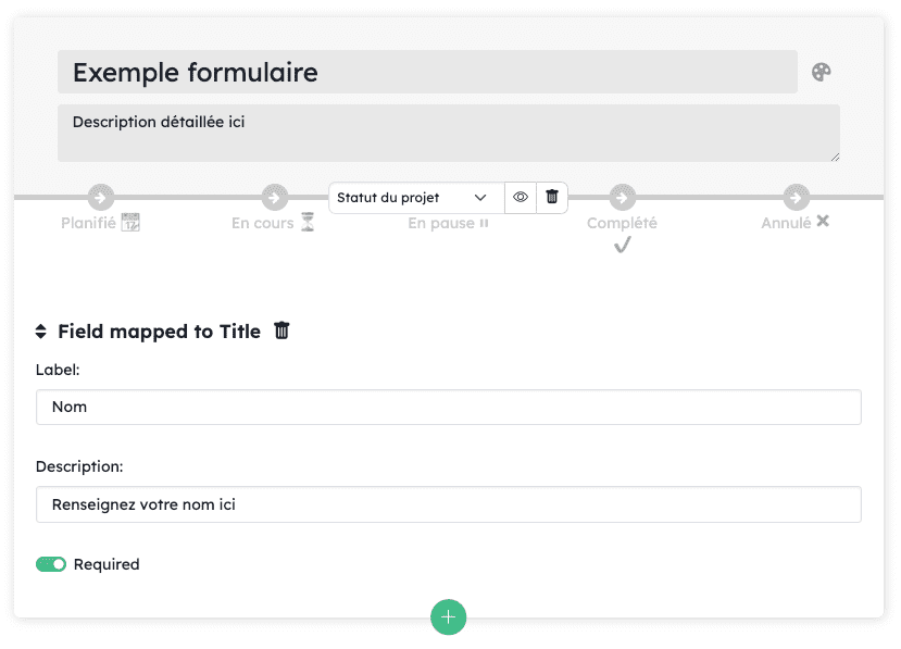 The possibility to add tracking once the form is submitted
UX/UI
UX/UI in Monday
Monday chose a clean visual with a more dynamic UI and animations but a UX that’s more difficult to comprehend. This is notably the case with the Kanban board with low card density that limits the number of displayed cards.
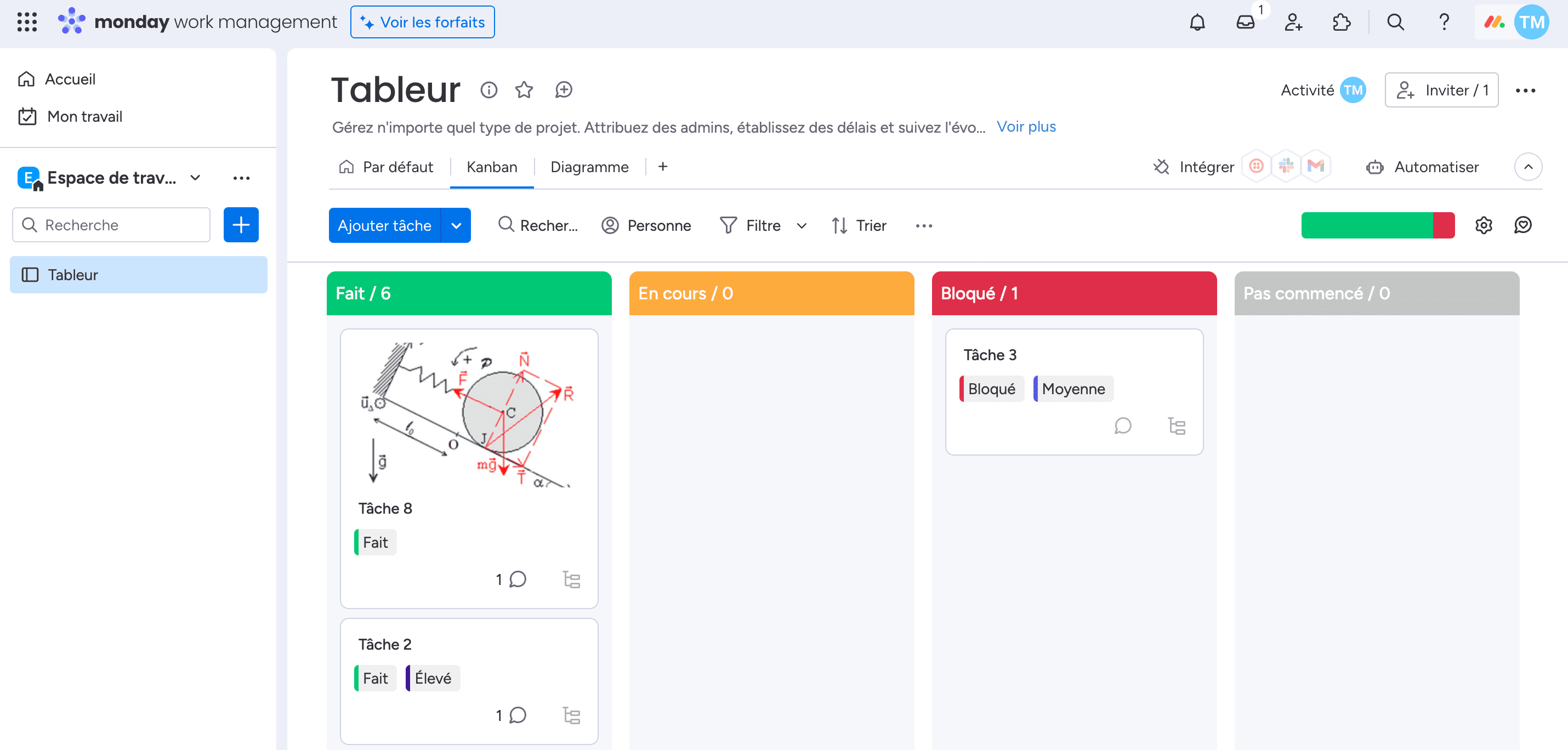 It works well for standard projects with few cards
UX/UI in Kantree
Kantree chose a more static UI to concentrate the user on important actions to take in their work. The “compact” density allows displaying more cards, a necessary prerequisite for complex projects. Moreover, its UX is easier to comprehend.
 The layout allows more card visibility for possible reporting directly on the view
Finally, which project management tool to choose?
The choice between Monday and Kantree will largely depend on your specific needs:
- Kantree is better suited for multidisciplinary teams requiring a flexible project management solution adaptable to various types of projects, which will be used by several teams from several departments.
- Monday.com is better suited for teams looking for an accessible and intuitive solution for standard project management.
Monday is optimal for an accessible solution, while Kantree is for those who require more advanced customization for projects that are either more complex or will grow in scale.
Ultimately, the best project management software will be the one that can best support your existing workflows while offering the flexibility needed to evolve with your team.
To go further
3 possibilities are available to you if this topic interests you:
-
1
Try Kantree here, it is free and you don’t need any credit card
-
2
If you want to learn more about how Kantree can adapt to your challenges, make an appointment with an expert on your use case.
-
3
Are you willing to join +1500 professionals receiving our advices and news on digitalization, collaboration, productivity? Register to our newsletter here.
If this article has been useful to you, consider sharing it. You can do it easily below.