Updates to the timeline
This summer, we’ve been busy redesigning our timeline view. With our old design, we felt like we were a bit off compared to the other views. UX-wise, we were missing a lot of the basic features available in the rest of the app.
A fresh new design
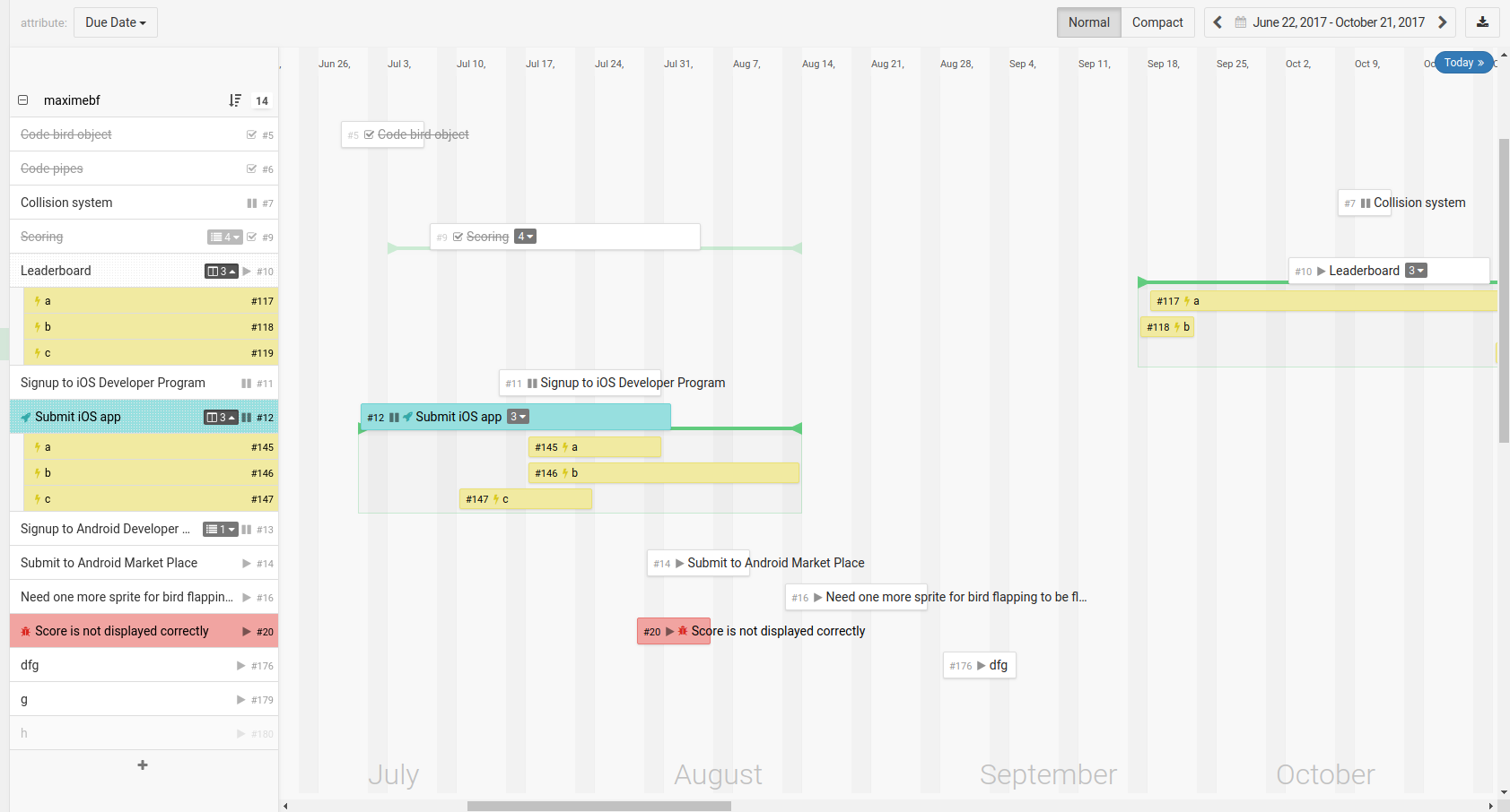
Here is a look at the new timeline view.

Card design is now closer to the one used everywhere else in Kantree. In the sidebar, cards can be right-clicked or renamed. In the timeline, cards are displaying more info like their status or their number of sub-cards. You can also add cards in groups.

The timeline background has been reworked: weekends appear clearly now, and the current day is nicely highlighted.
Toggle sub-cards
Our main addition to the timeline is the ability to display sub-cards in it.

On a card, you can click on the number of sub-cards to display/hide them. If the date range of the sub-cards exceed the one of the parent card, a green bar will represent the complete period covered by these dates. If you hide the sub-cards, this bar remains visible so that you will notice the sub-cards total date range. This total date range is used in compact mode, instead of the card date.

Auto update dates of related cards
If you are using a relationship attribute to indicate related cards, you can now update their dates when there is a change. You can choose whether Kantree should update cards referenced in the attribute or cards referencing the current card through this attribute.
Find these setting in the options of relationships attributes.
With this changes, you can use the timeline in new creative ways. For example, you can manage your OKRs or your strategic roadmap. You can also use the timeline to handle projects with deadlines like organizing an event or launching a new product.
Let us know what you think of our new timeline on Twitter @kantreeapp!
We have one more feature to show you in the coming days, so stay tuned!