Kantree 10.0 includes a new interface, inbox, and navigation
Drumroll! With this product release, we are introducing major changes to Kantree. Version 10.0 comes with a sleek, modern interface, improved navigation, and a brand new inbox to help you better keep track of projects. Let’s take a look at all the new & updated features.

Introducing the inbox
In the sidebar, the second item from the top is your inbox. Think of it as your own project hub, an easier way to track the work you’re involved in.
The inbox acts as a notification center and is the place to follow conversations across cards. It shows all the cards you’re assigned to, tasks, and personal calendar.
Tip: You can set the inbox as your homepage in Kantree by clicking the link in the top right corner.
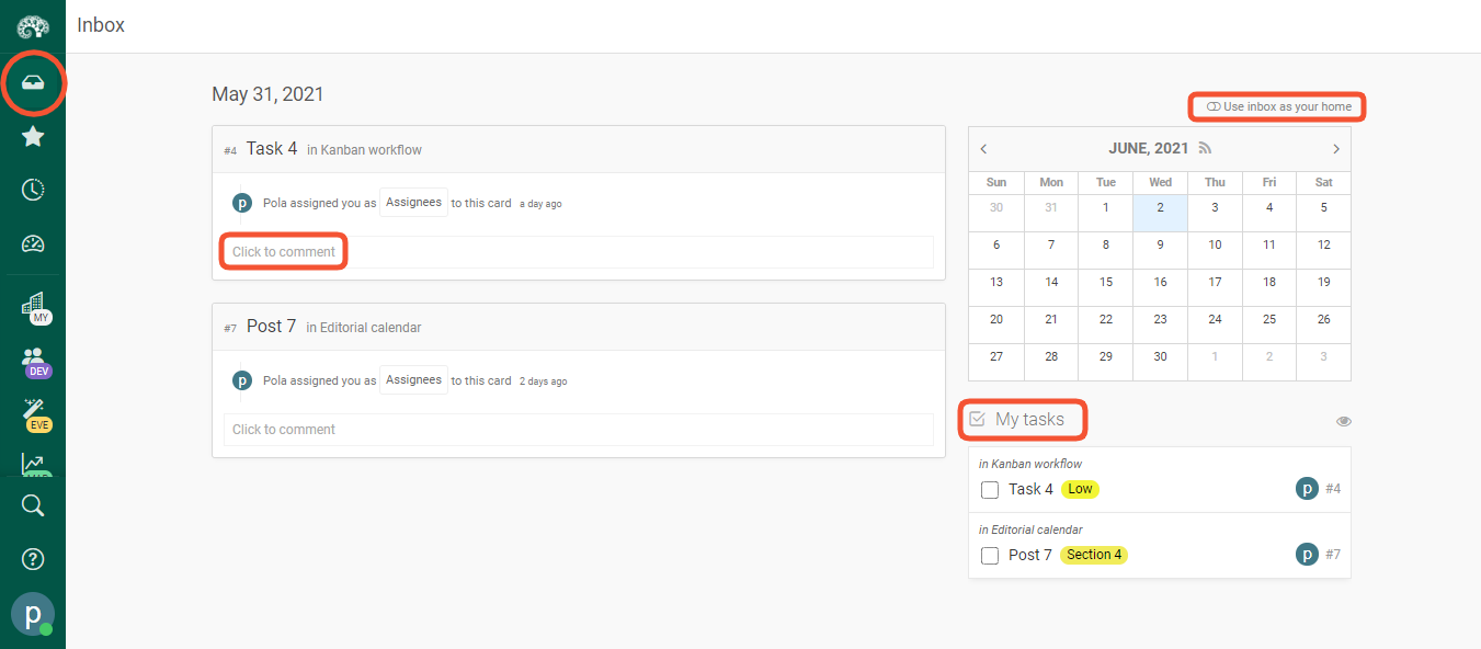 The new inbox is your own project center: use it to see notifications, follow conversations across cards, see all your tasks and personal calendar. You can set the inbox as your Kantree homepage.
New navigation
We are excited to introduce a new, permanent system sidebar for faster navigation across Kantree. Just like before, it’s located on the left side of your screen, but we’ve tweaked the style to make it easier to use.
- The Kantree logo at the top of the sidebar is the home button, bringing you back to your organization’s page.
- Below the logo, you will see the new inbox - your personal workspace and notification center.
- We’ve added a star icon, which is a shortcut to your favorite/saved projects.
![]() The permanent system sidebar brings faster navigation, letting you access your work in fewer clicks.
The permanent system sidebar brings faster navigation, letting you access your work in fewer clicks.
The new sidebar allows you to only focus on a single organization*. Hover over the office building icon (or your company logo, if you’ve uploaded it) to access the organization’s main page and its associated workspaces (projects) without leaving your screen. You can go directly to one or see them all on your screen when you click “explore all workspaces.”
*That’s the default setting for users with a single organization.
When you create a team, its icon will be displayed on the sidebar (use the dark green scroll bar to navigate through all the teams you’re part of). Just like with the organization’s icon above, you can quickly access all your team’s workspaces or add more without hitting the back arrow or going to another place on the platform.
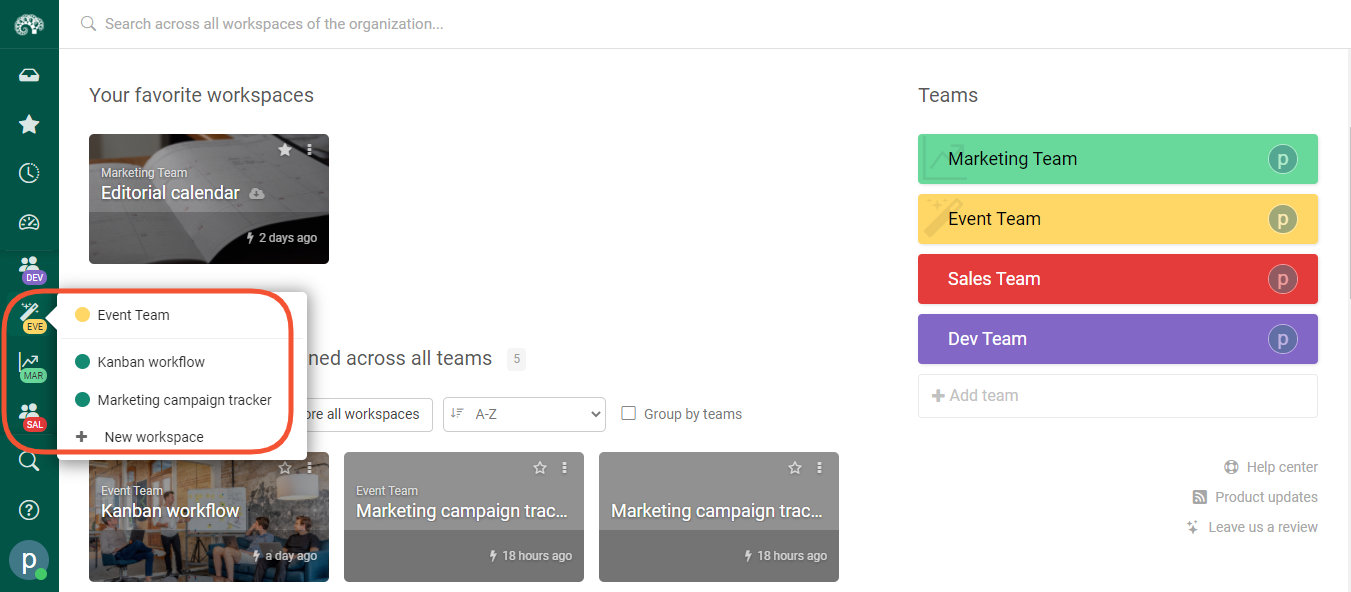 Use the sidebar to quickly switch between your team’s workspaces or add new ones.
New ways to manage views
With this update, you can quickly add new features directly to your project (workspace). Once you’re in it, a workspace sidebar will appear on the left side.
Click on the “add view” button to add shared and private views. You’ll be able to choose from main views (kanban, checklist, table, calendar, timeline) or add dashboards, journals, logs, or forms.
As you can see here, forms are now managed like views. If you create multiple forms, each will have its own place on the menu. We’ve also added a few pre-configured suggestions, e.g. cards you’re assigned to or recently updated cards.
By the way, you can still switch between main views from the top bar, like in the previous versions of Kantree. And when you are in a workspace, save your temporary view as permanent (shared or private) by clicking the pink button at the top.
A word about new names
If you’ve been using Kantree for a while, you will notice that a few things have been renamed to fit the latest redesign. The new naming convention is as follows:
- Project is now “workspace” .We feel this word better reflects all the possibilities that exist within Kantree for managing your workload.
- Card model will be called “type”, a more commonly used word.
- Reports have become “dashboards”. Because these are dynamic, the dashboard better describes what’s happening. (We plan to re-introduce reports as saved dashboards in the next release.)

Improved user interface (UI) across the app
The new UI is designed to facilitate navigation and give you quick & easy access to projects. Kantree 10.0 comes with a new set of icons, improved wording and menu content, a more airy, eye-friendly checklist view, plus redesigned organization pages.
On your organization’s page, check out the new top bar, clickable team menu on the right, all the workspaces (previously called projects) you have joined, and a redesigned template library.
Need some help or resources? You can access our help center and blog with features, tips, and articles about work management directly from the page (links are below the teams and in the user menu in the bottom left corner of the screen).
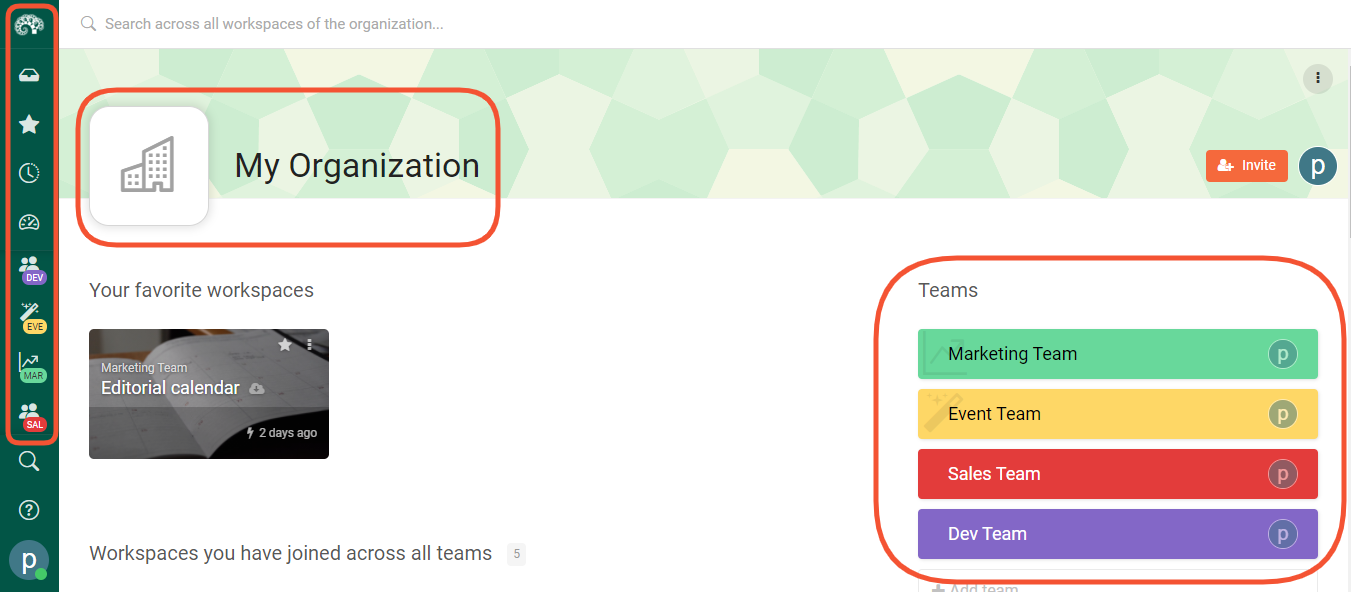 The updated organization page includes a new top bar, clickable team menu on the right, and all the workspaces (previously called projects) you have joined, a redesigned template library.
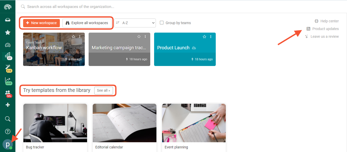 You can access our help center and blog feat. product updates, tips, and work management resources directly from the page: click the links below teams or go to the user menu.
Creating workspaces & dashboards, simplified
By clicking the large plus icon on the sidebar, you can quickly create new workspaces, either from scratch or through our template library. Choose from featured templates or browse by category (a menu will appear).
Similarly, you can create global dashboards by dragging & dropping widgets.
New formula editor
For those of you who use formulas, life just got easier. You no longer have to input formulas on your own, thanks to our new editor.
Here’s how it works. Go to a card and add a new formula field (click more types on the pop-up menu to see it). Once you click on the field, an editor with a number of variables and functions will pop up and guide you. Select what you need from the menu, replace the default field value(s) with your own, then click save. You’re done!
Sorting columns in table view
This added functionality makes our table view (similar to a spreadsheet) more flexible by allowing you to sort data by columns.
Try it out: go to any project and set it to table view, then click on the small triangle in a given column. You’ll be able to sort it in ascending or descending order.
Tip: If you want to sort only select sections in table view, click on the three dots in the section title, then sort by a chosen parameter.
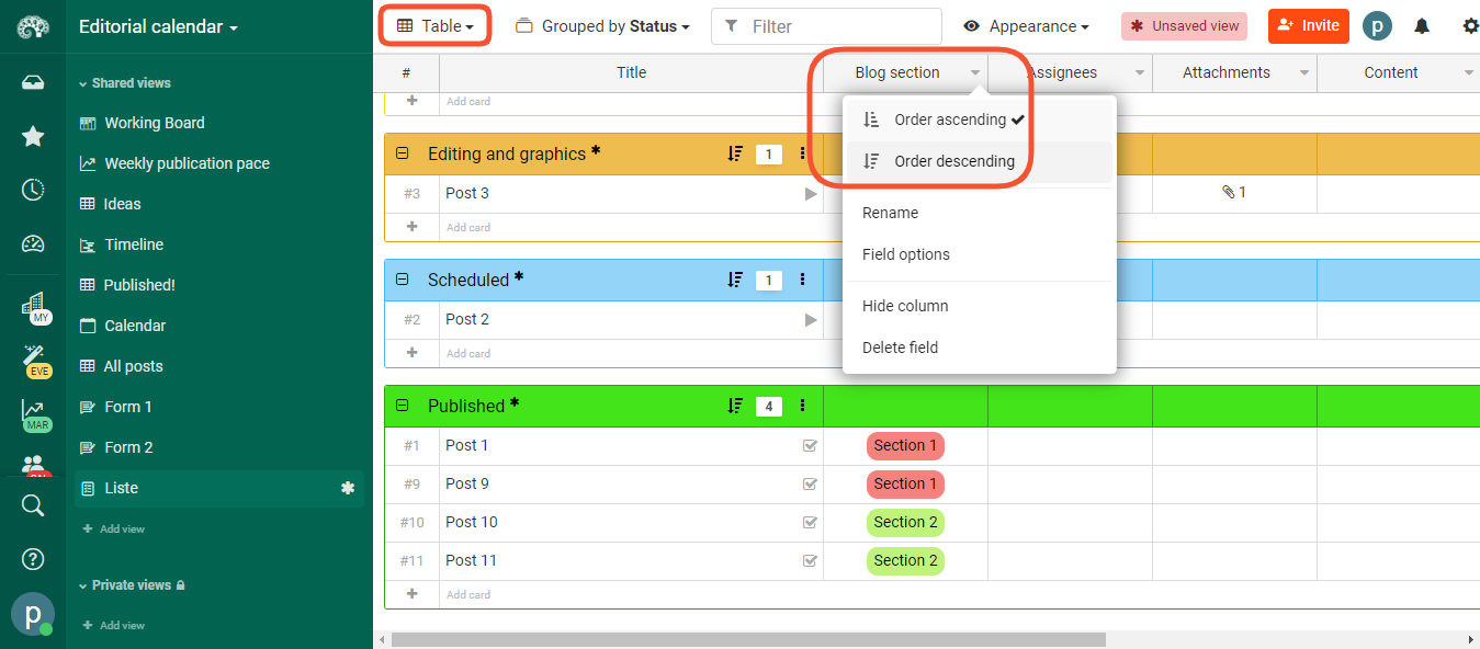 In table view, you can now sort columns in ascending or descending order.
Follow our public roadmap and be a part of building Kantree! As a user, you can submit ideas and comment on items in progress. Questions? Contact our team.