Introducing a fresh new design
We’ve released some new features and redesigned Kantree to make the app simpler and more modern. It makes it easier to visualize your projects through different perspectives, and help you focus on the work that matters most to you.
Simpler UI and nicer look
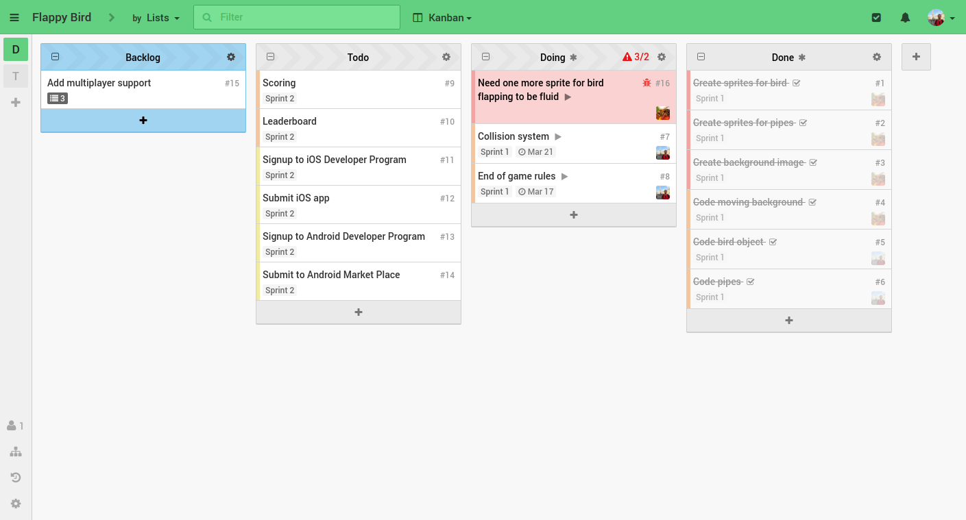
We’ve refreshed the style of the application to make it simpler and feel lighter. The default theme is brighter, the style of the columns and tables are most consistent, and the cards stand out better on your boards.

The application now has a single toolbar. It makes better use of your screen space, it brings the main visualization options closer together, and makes them more accessible. It seems much easier to switch from one dimension to another, to filter cards and change your view from kanban to calendar.
Additionnaly, we’ve updated our promotional website.
Group cards by attributes
At the end of last year, we added the ability to group the cards of the same project under different perspectives using our “group type” system. Unfortunately, this was hard to discover and not obvious at all. We think this system makes Kantree really powerful so we’ve made it much more visible in the new design.
With this new release, we’ve also added the ability to group cards by attributes in kanban and table views. For instance, this allows you to assign the cards of the next iteration just by drag and drop, or to set the size of each cards by moving them to a different colmuns, right from the kanban. Not all attribute types are supported at the moment but we will expand this in the future.
Saved views
As Kantree aims to help you focus on things that matter for you, we are introducing the ability to create custom views. They are a combination of filters, card grouping and view modes to quickly view a board through a specific angle.
Here’s an example:
- cards labeled ‘design’ that are assigned to me, and due tomorrow
- grouped by milestones
- in kanban mode
New projects comes with 3 prebuilt saved views: a default view to switch back to the default view, a my tasks for all the cards assigned to you and one to see what’s due this week.
Custom views can be created on the fly, with the option to share them with other project members. This is particularly useful to give teams the ability to switch to a Scrum view (eg cards in table grouped by sprint).
Never miss your due dates
In addition to in-app and email reminders, You can now get a calendar feed of your projects, to view the due dates of your cards as events in external calendars (like Outlook and Google Calendar).
Faster
We’ve also improve the performance of the Web app. The drag and drop behavior is much smoother and more reliable, especially in Firefox. Scrolling also works better - especially on Mac.
We hope you’ll find Kantree even more powerful as a visual management app. Head to our help pages to learn about the many visualization and customization features, and let us know what you think of this update!