New in Kantree 10.0: Redesigned sidebars for faster navigation
One of the major updates introduced with Kantree 10.0 is the new system sidebar. More intuitive and packed with shortcuts, it makes navigating through Kantree a breeze. Here’s a breakdown of its features.
The system sidebar is always visible: from your organization’s and team pages, workspaces, template library, and your account page. This means you can reach any board in Kantree in fewer clicks. Fast and easy, without getting lost.
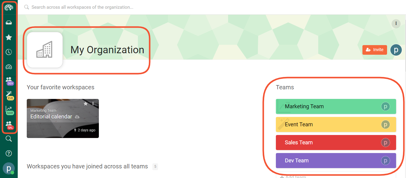
New icons on the system sidebar (to always find your way)
The navigation is on the left side of your screen and features all action icons.
Starting from the top:
- The Kantree logo is your home button, which by default brings you back to the organization’s page from anywhere in the app.
- Below that is Kantree Inbox, your project and notification center that can be set as your homepage (we recommend that 100%).
- Go to the star icon further down to access all your favorite workspaces.
- Hover over the clock icon to view the recently opened projects.
- The next icon gives you access to dashboards (previously called reports). You can also create new dashboards directly from there.
- The skyscraper icons are the heart of the sidebar, taking you to all your organizations and workspaces without hitting the back button (more below).
- Click on the plus icon to add more workspaces to your organization or team.
- The search and help buttons are permanently featured above the user menu. Click on the question mark icon to view user guides or contact support.
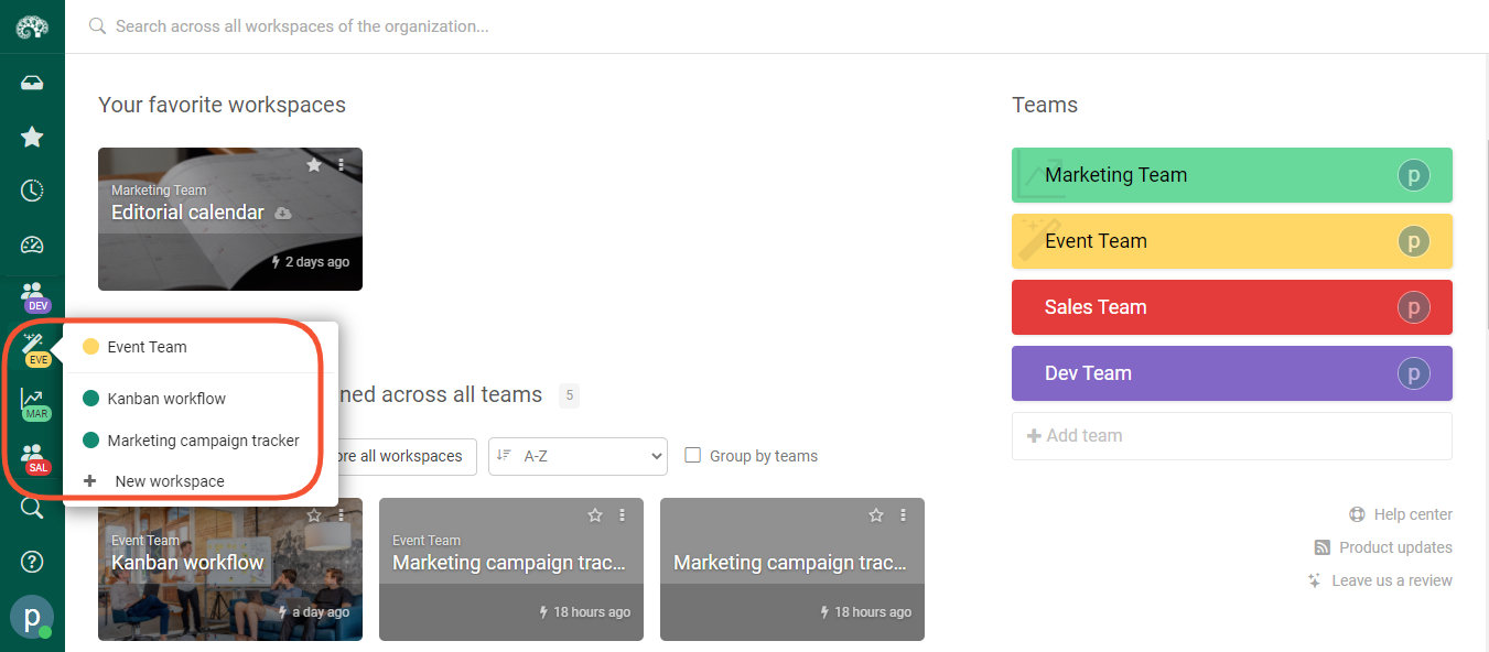
Quick access to organizations & team workspaces
The redesigned sidebar displays all the organizations and team workspaces you’re a part of. Organizations are marked by skyscraper icons, team icons vary, but they are all visible on the sidebar.
What is great about this feature is that you can access your work from anywhere in Kantree in a click or two, without going back or opening new tabs. You can also add new workspaces directly to your organization or team without leaving your screen.
*If you belong to several organizations, you get to choose which ones appear on the sidebar. Go to the organization section of the user menu to display them all or focus on just one, which is the default setting for users with a single organization. You can also hover over the skyscraper icon of the organization you want to see and click “focus on this org.”
One click to account settings & useful links
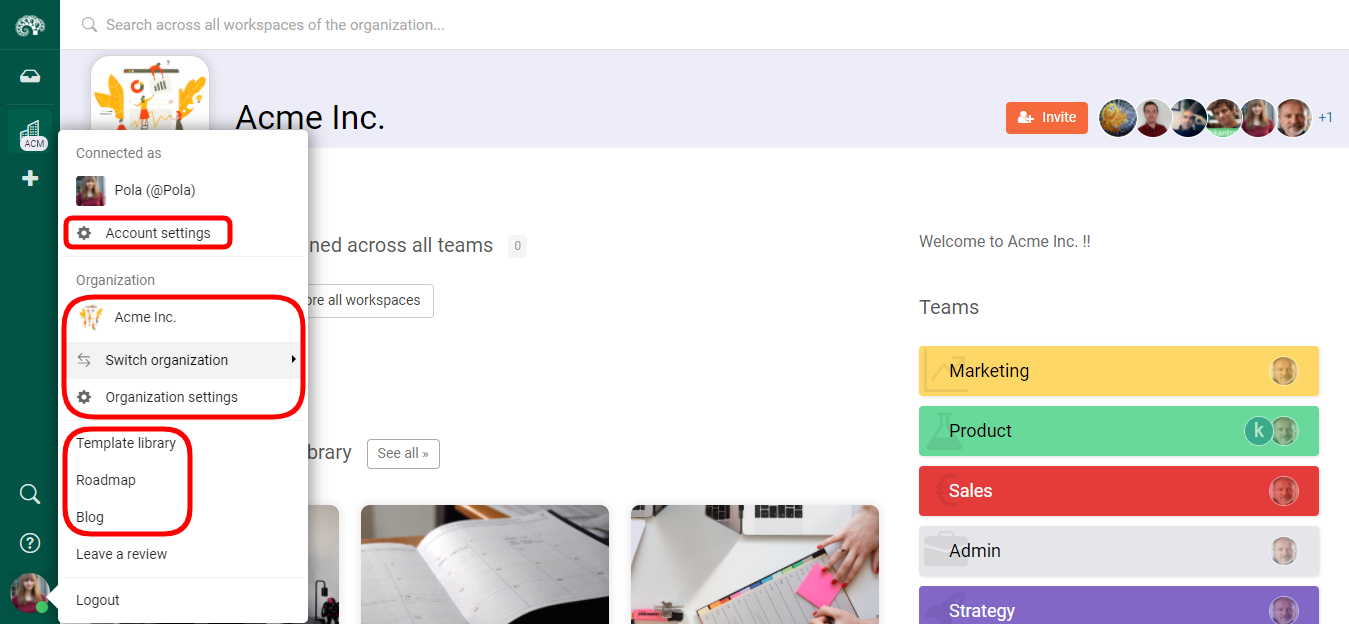
Your user menu is located in the bottom left corner of the screen. Click on it to access your account settings or to quickly switch between organizations, as mentioned in the previous section.
This is also where you’ll find links to the ever-growing project template library, our blog with product updates, Kantree tips and work management resources, plus the Kantree Roadmap that shows what new features we’re working on.
Project sidebar with toggle button for more screen space
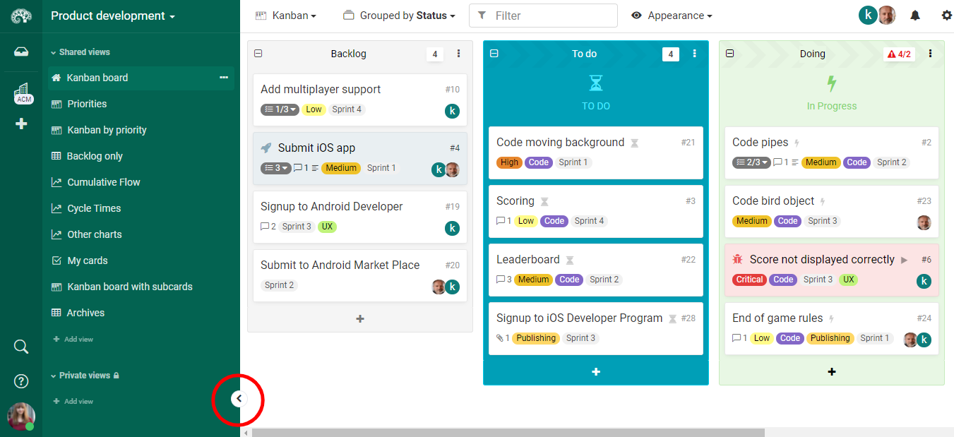
When you go to a workspace, you will see the project sidebar appear next to the permanent navigation, showing shared and private views. But if you want to free up more space on your screen, you can hide the sidebar by using the toggle button.
Hover your mouse over the right edge of the project sidebar (towards the bottom) to see the button. Click on it to hide the sidebar. Hover again to take a glimpse when needed or click the button again to reattach the sidebar to the workspace.
Follow our public roadmap and be a part of building Kantree! As a user, you can submit ideas and comment on items in progress. Questions? Contact our team.