Introducing a new color scheme
We liked the previous Kantree green, but we had it for a while. When it comes to visual identity, sometimes you need to freshen it up. Entering our 5th year on the market, we thought the time was right for a new color scheme.
The refresher follows a few design tweeks implemented earlier, such as a new default look for cards in the kanban view. And now, say hello to…
Kantree green 2.0
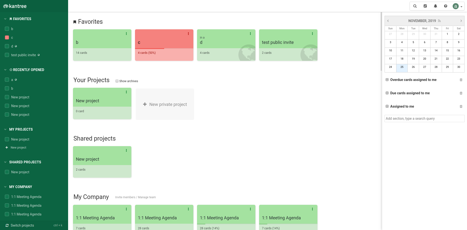
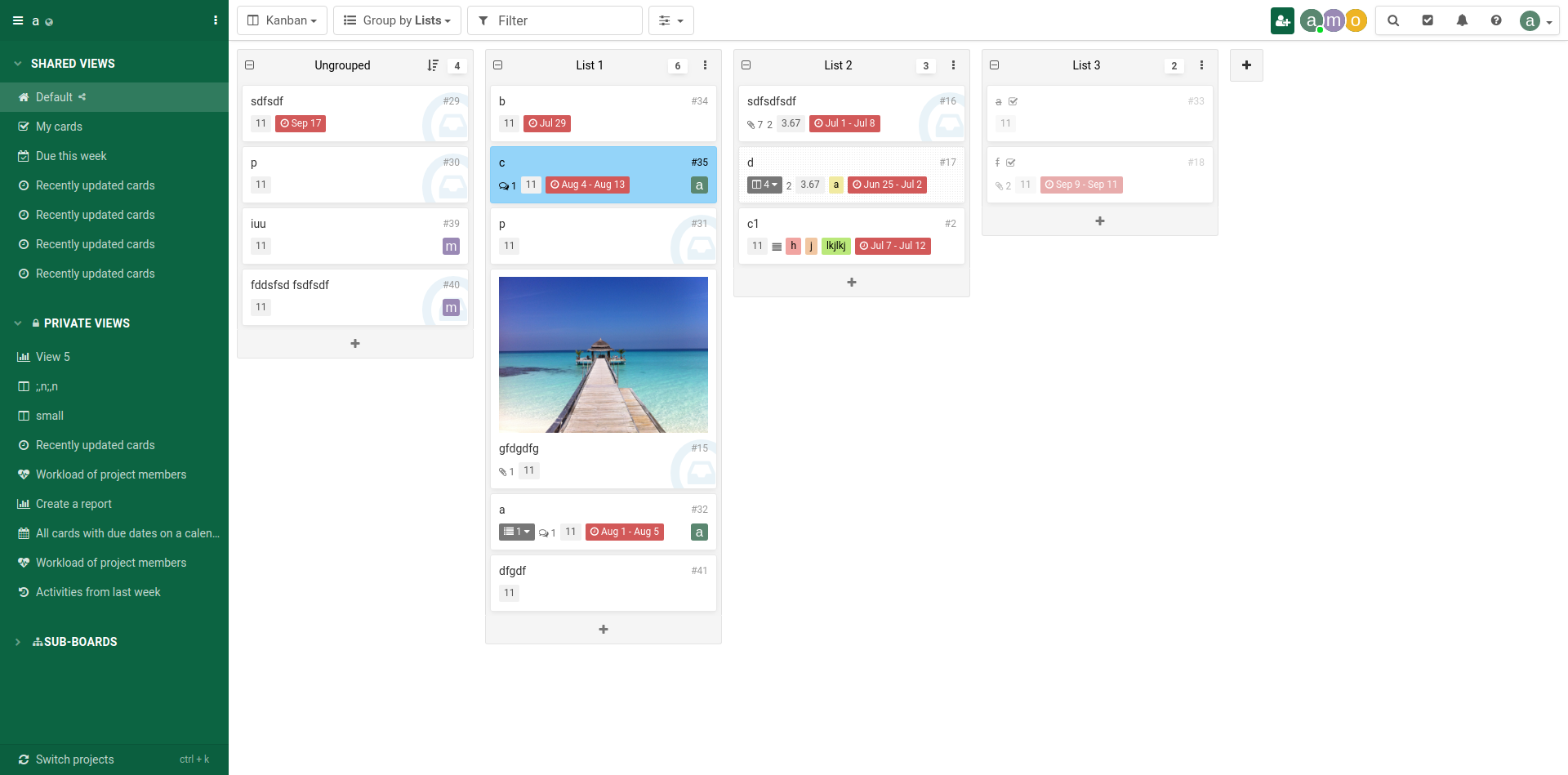
Emerald green, if you will. Not a drastic change, but one we think will make a difference in your daily use of Kantree. Although the new shade is a bit less vibrant, it offers a higher contrast and is softer on the eyes (a good thing if you spend hours in front of the screen). Have a look at the sidebar:

We also think the color is well-suited for business use cases of Kantree and will give your boards a polished look, great when you show projects to clients or external collaborators.

If you still prefer the fun and bright green from before, don’t worry. You can change the default color in your account settings. As always, customize everything with Kantree!
Got ideas?
Follow our public roadmap and be a part of building Kantree! Members can submit ideas and comment on in-progress items. Questions? Send an email or tweet us at @kantreeapp.