Introducing improved card customization
The first release of the year is in the continuity of our work to improve Kantree’s user experience started last summer.
The most notable change is our new menu system. It includes larger menu items and better navigation to help you reach more advanced options more easily. Not all menus are taking full advantage of the new system yet but we’ll release incremental updates over the next few weeks.
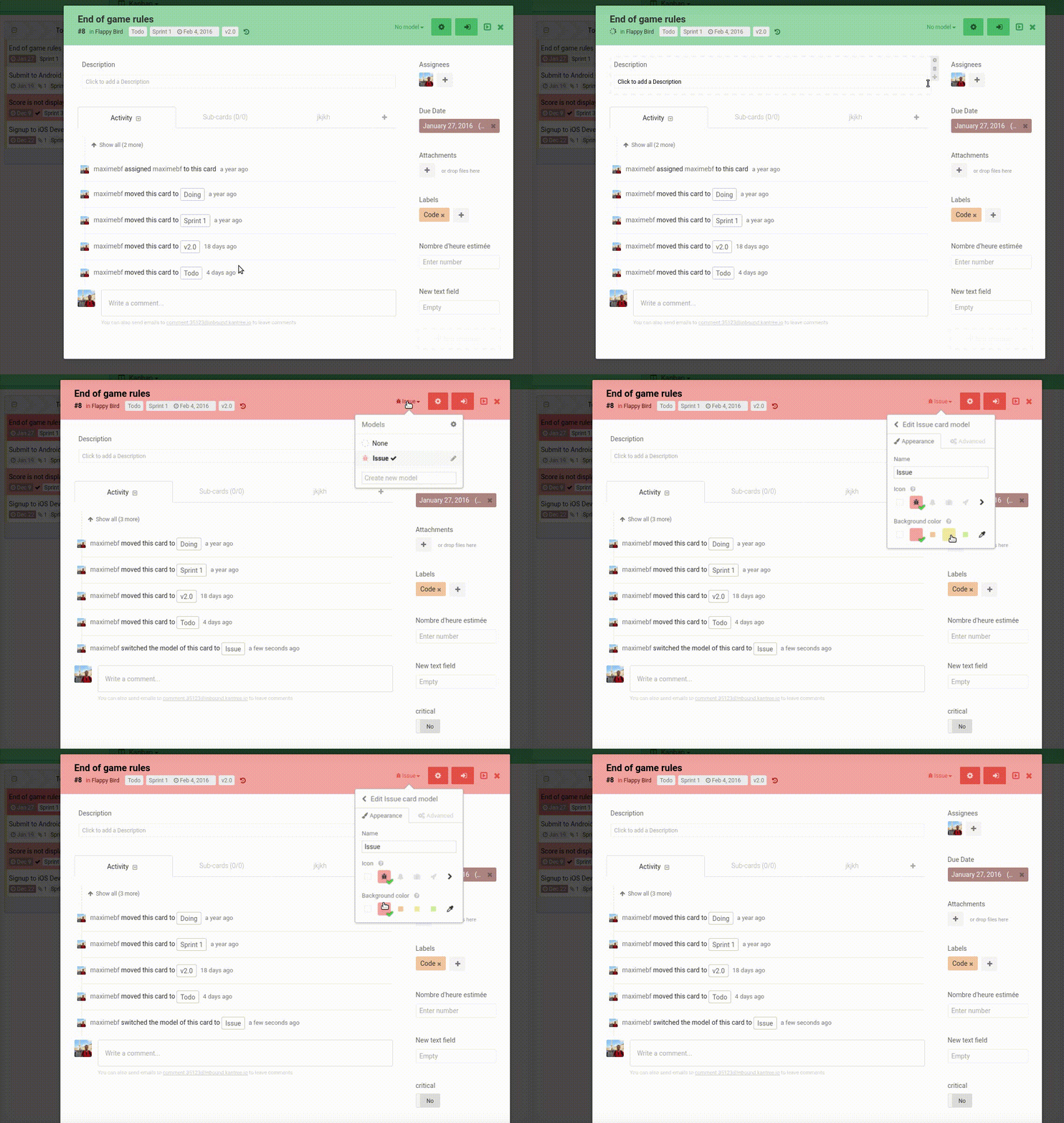
The new system allows editing options directly from menus. Our goal is to remove settings pop ups as much as possible. The best example of this is the new model switcher menu:

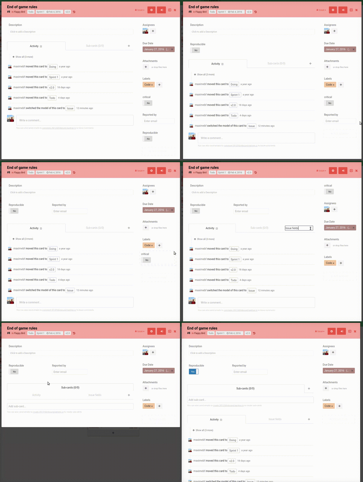
The second big area of improvement is regarding attribute positioning on cards. You can now drag & drop attributes and create additional tabs. Just grab the small icon when hovering attributes and move them around. You can also move tabs the same way. This means you can now move the “Sub-cards” tab above the “Activity” tab.

These improvements now make it very straightforward to add attributes and customize the appearance of cards.