A refreshed interface for faster project navigation
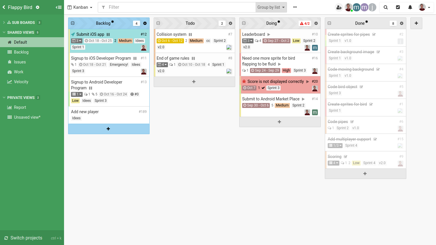
Today we are introducing a refresh of our interface with the goal of improving navigation across projects. This new navigation paves the way for the incoming cross-project capabilities of Kantree.

The new interface puts the focus on the sidebar. Navigation has also been vastly improved and is now very fast, consistent and feels very natural. It is not a burden anymore to switch from one project to another.
While it may feel very different, there are actually very little changes in term of the way you use Kantree. Appart from a few obvious tweaks, everything is still at the same place.
This refreshed interface includes a quick project switcher accessible using Ctrl+K. Flick through the list of recently opened projects or instantly search for another project. It makes moving through your projects a breeze. The new sidebar has a few other bonuses: recently opened sections, dockable sections, etc…
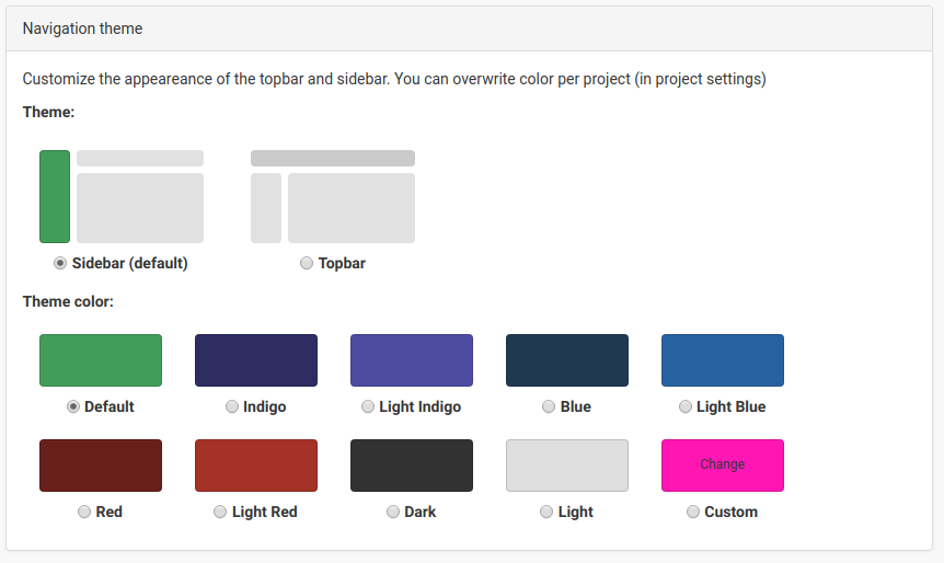
Following our usual design philosophy, we had to make this new interface customizable! Under a new Appearance tab in your account settings, you will be able to chose between the sidebar or topbar layout and a main color.

So where are we going with this new interface? As mentioned in the introduction, new cross project features are coming very soon. Being able to work on multiple projects and creating views combining multiple projects are our top user requests at the moment. We have been working on it for a while and this new interface is part of the work. To shift the focus from single projects to multiple projects capabilities, it was important to highlight the navigation as the main component of the interface.
Let us know what you think about this direction and new interface. We are very excited with this new look and the upcoming changes and we believe it will improve greatly your experience.
For Kantree Enterprise customers, this new interface is introduced as part of the 7.0 release.