Cards
Cards are the smallest unit of data in a project. They are flexible to adapt to all your needs. To customize the card structure, you must have Administrator rights.
For example, you can configure a card to represent:
- a feature
- a bug report
- a contract to sign
- a candidate to recruit
You can save different card structures using card types. See Card Types.
Card Hierarchy
By default, a card can be a parent card or a child card (sub-card). You can create as many hierarchy levels as you need. For example, you can create a project card with first-level sub-cards representing phases, and a second level on those to manage tasks. With card types, you have custom card structures for each category of card.
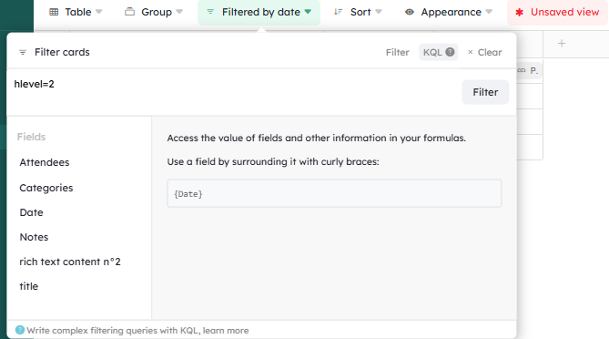
To filter by hierarchy level, use:
- Parent card (main card):
hlevel=1 - Child card (first-level sub-card):
hlevel=2 - Child card (second-level sub-card):
hlevel=3
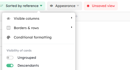
Remember to display sub-cards from the Appearance menu by enabling “Descendants”.
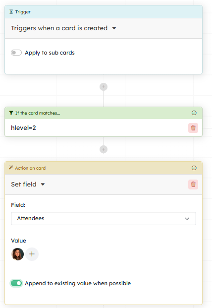
In this configuration, the action will be triggered only when first-level sub-cards are created :
Card Fields Overview
You can think of a field as a data field for your cards. It has a defined type, a name, and a position on your card.
You can give it a description configurable in the Field Options by filling in “Description”. Hover over the question mark to display it.
You can decide whether this field should be visible on card previews for the Kanban, List, and Table views. To do so, go to the “Appearance” menu, then “Displayed Fields”.
The list lets you see all fields available in the workspace and identify whether they belong to specific card types. They are presented in alphabetical order. If you want to present the information in the preview in your preferred order: deselect all using the “toggle all” button at the bottom of the list, then enable field display in the order you want them to appear.
Field categories
Here is the complete list of all available field types:
- Date: day, month, year and hours, minutes if you enable the relevant option (used in calendar and timeline views)
- Files: attach files from your device or a URL
-
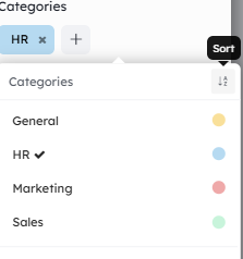
Labels: labels with customization options (color, icon). The Label field lets you group your data by its values. If you have 2 Label fields, you can visualize with a double grouping (as with contexts) using the Kanban view.
By default, values are displayed in the list according to the column positioning in the Kanban view. So, if you move columns it will change the display of the values in the list.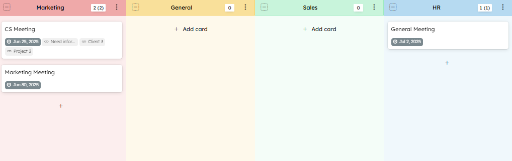
✨ 2026 New Feature ✨ — Alphabetical sorting of Label field values: when you have a large list of values, use alphabetical sorting to find the value you need more quickly.
- Members: list of project members, used to assign someone to a card, and also to build analytics reports, such as workload
- Number: any number (used to build analytics reports, as points to calculate Burndown charts or velocity)
- Rich text content: a long text with a rich text editor (and markdown support)
- Text field: a short text (with an optional color)
- Time: hours, minutes, seconds
- Yes/No value: toggle between an enabled or disabled state
- Card: use another board as a data source; you can select one card from that board at a time
- Card relation: create relations with multiple other cards; if two cards share the exact same card relation field, the link will be visible in each card
- Email: email-type value
- Iframe: add an https:// URL
- Indicator: icon selection with a customizable color
- Like/Dislike button: a button that lets members vote
- Link: URL (you can add a few words before your URL to use as the link label)
- Address: an address displayed on an Open Street Map. You can choose not to display the map (in the field settings)
- Look up: works with the card relation field to display information from another workspace. See the Look Up section below
- Multiple choice: choose a value from a list of items. Works similarly to Labels
- Phone: phone-type value
- Size: choose between S, M, L, XL (used to build analytics reports, as points to calculate Burndown charts or velocity)
- % Percentage: a progress bar that can be updated manually or via an automation, to visualize for example the completion level of a task or a project
- Formula: calculates a value from other field values or card properties. To build a query for your Formula fields, you need to be familiar with our query language, KQL. You can use formulas in other formula fields or in project reports
Kantree also provides purely cosmetic fields to customize the layout of your cards:
- Separator
- Label
The Labels and Multiple Choice fields use the same system as project contexts. You will find the same options in context settings and in these fields. They also let you choose a default value.
Editing a Field
By clicking on the field menu, you access the Options.
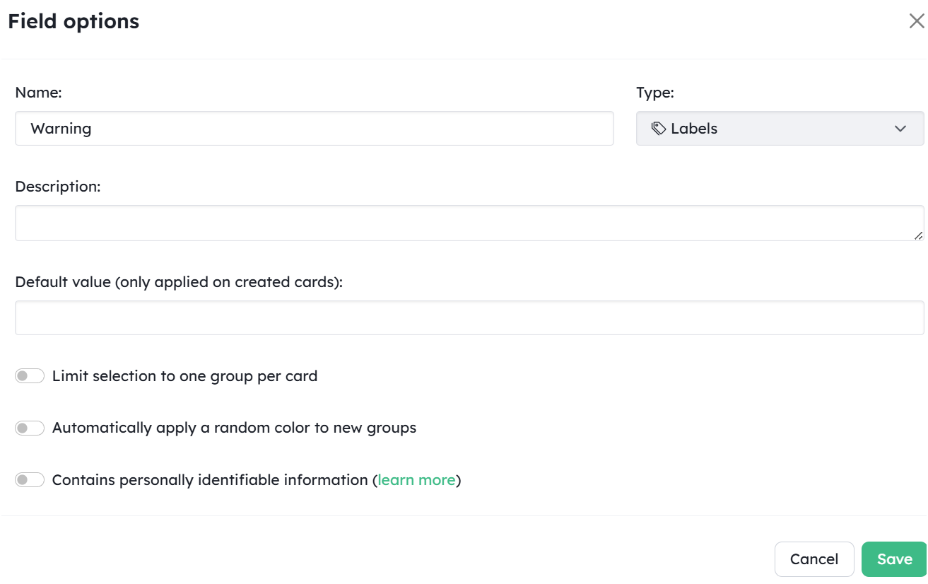
It is not possible to change the type of a field. Delete it and create a new one.
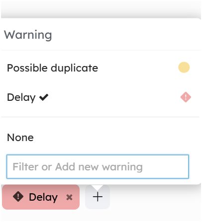
Warning: if data has already been entered in the field, remember to export your data before deleting it so you can re-import it into the new field using the import feature.
Card Relations
You have several ways to link cards together.
Card Relation Field
The card relation field lets you create links between your cards. You can select any card from any project. This creates a one-way link to the selected card.
To automatically display — under the two-way arrow icon — the cards that have referenced the card you are currently viewing, enable “See cards referencing this one” in the field options.
If you want to permanently display cards referencing the one you are viewing, go to the field options and enable “See cards referencing this one”. The cards will then appear directly without requiring any click.
The “Relation” field can be used to group by relation, giving you an overview of all cards linked to the same card — e.g. viewing all requests tied to the same issue and prioritizing them.
The card relation field can be used in automations as an action trigger. See the “Workflow Automation” guide.
If you want to create cards from an Excel file, use “Import from spreadsheet” and map the column containing the card IDs (export your cards beforehand to retrieve those IDs) to the card Relation field.
Adding a Card Relation
Click the ➕ next to the two-way arrow icon. On the left, choose the workspace to search in. On the right, you can search by card name or reference — e.g. #3 — in the “Filter” field.
Note: The “Filter” field does not support KQL language.
Then select the card relations to add by clicking “Add” or “Remove”.
You can also create a relation with a new card directly from this screen
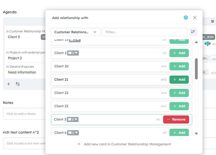
The sort option lets you display cards in alphabetical order.
You can search for cards in the list by entering the card reference in the filter bar — e.g. #6.
Field Options
Pre-filter available cards
This option lets you apply a permanent pre-filter to the list of cards shown when adding a new card relation. For example, you can filter on sub-cards by adding hlevel=2, or on a status such as state=done.
Update date attributes in linked cards
You can update the dates of related cards when one of them is modified. You can choose whether Kantree should update the cards referenced in the field, or the cards referencing this card through this field. This setting is found in the field options.
You can add a condition by checking “Only move future dates when moved forward”.
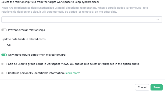
Other options
You can:
- Limit the card relation to a single card by selecting the workspace under “Limit relation to a single card”
- Display cards that reference the card you are on — “See cards referencing this one” (see above)
-
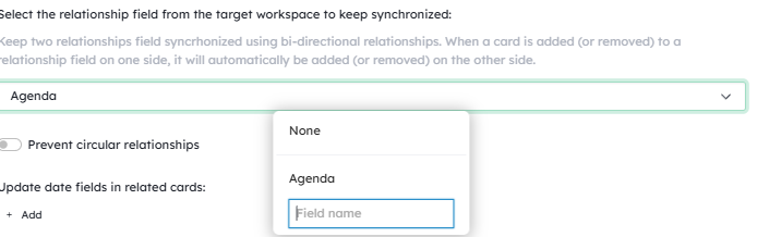
Enable bidirectionality by specifying the “Relation” fields to connect. To do so, enter under “Link this field to another relation field to create a two-way link” the name of the “card relation” field with which the bidirectional link should be established.
Note: type the field name and press Enter even if it appears in the list.
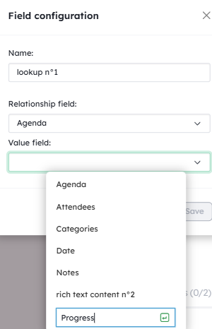
“Look Up” Search Field
This field lets you display in your card information coming from relations that you need to work with, even if that information is in a card from another workspace.
Example: For a project involving several teams, you may need to permanently have the progress context of each team on a task. You can now visualize that progress directly from your card.
To use a “Look up” field, you must first have a card relation field containing a linked card. Then add a “Look up” field to your card, and select the reference “Relationship” field as well as the field present in the linked card that you want to display in “Look up”.
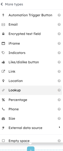
Note: To select the field to display, you currently need to type its name (even if a field with the same name appears in the list).
Editing a Field
You can rename a field by double-clicking on it. Access the field Options by clicking above the field name. It is not possible to change the type of a field. If you made a mistake, you will need to delete and recreate the field with the correct type.
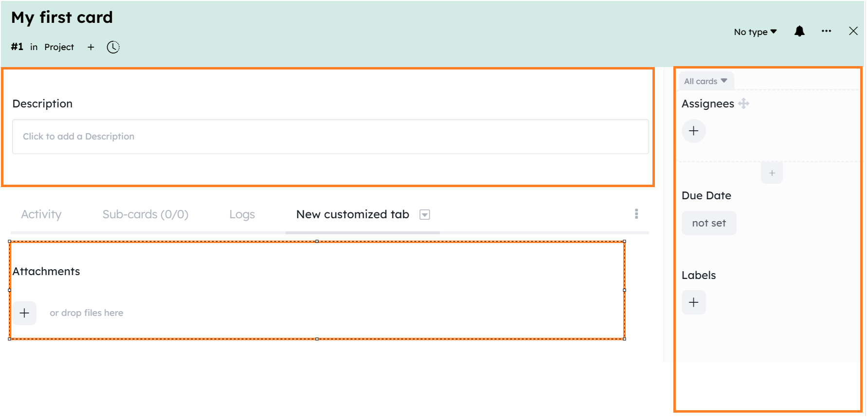
Configuring Card Layout in a Project
A simple project is created with a small collection of fields available for your cards.
Here is the list of predefined fields in a project:
- Description: a text describing the card
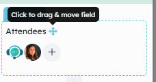
- Assignees: project members assigned to this card. They are subscribed to the card and its activity feed.
- Labels: colored tags to quickly identify and filter a group of cards.
- Due date: the date by which the card must be completed. Assignees will receive a reminder 24 hours before the due date.
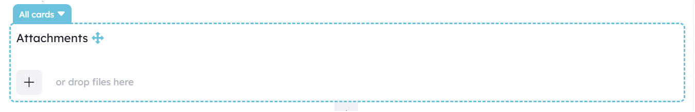
- Attachments: upload documents to the card.
Adding Fields
In a basic card in your project, you can easily add new fields using the blue dashed ➕ button “Add a field” that appears on hover between fields.
These fields will then be available for all cards in your project.
Behind the scenes, all cards in a project share a common collection of available fields. Adding a new field to a card without a type will extend this shared collection.
Changing a Field’s Position
Move your field by clicking and holding the small handle icon.
There are several zones where you can drop your field:
- above the tabs
- in the right side panel
-
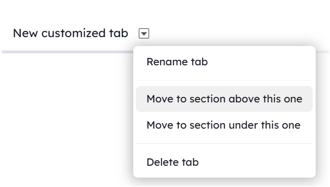
in a custom tab — you can create tabs by clicking the + to the right of existing tabs and giving it a name
Within the same zone, fields are positioned relative to the other fields in the same collection (this rule will make more sense in the next section on card types).
You can change this order by dragging fields.
Warning: A change in the position of a shared field will affect all cards in the project.
Deleting a Field
You can delete a field using the Field Options available by clicking above the field name.
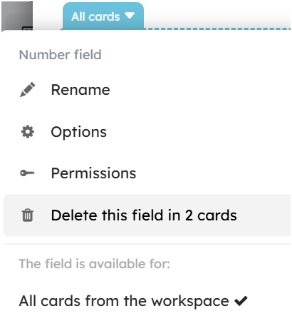
Warning: Be careful not to unintentionally lose data when deleting a field. All cards that have access to this field will lose all data associated with it.
Moving Card Tabs
You can move card tabs on top of each other, allowing you to have Activities, sub-cards, and any other tabs visible at the same time. Simply grab the tab by its title and move it wherever you want.
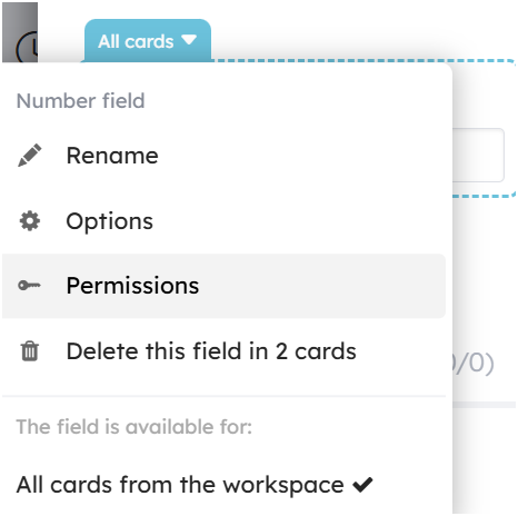
Changing Role Permissions on a Field
In the Field Options, the “Permissions” setting lets you change your project role permissions for that specific field. You will find more information in the guide on roles and permissions.
Coloring Cards
✨ 2026 New Feature ✨
Until now, the only way to assign a color to cards was through card types.
You can now automatically assign a color to cards based on your conditions.
- This feature is available in the Appearance menu under “Conditional formatting”.
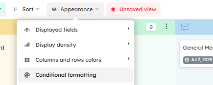
Rules apply across all views in the workspace.
Configure your rules using the filter assistant.
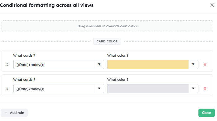
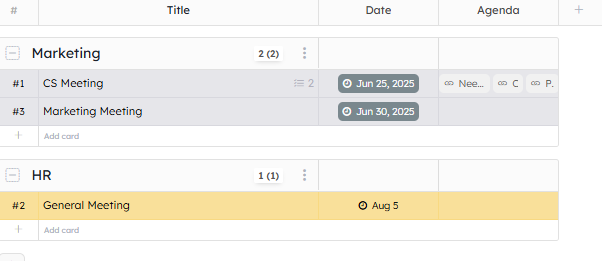
You can reorder your rules by dragging and dropping them. If conditions overlap, the rule positioned highest will take priority over the ones below it.
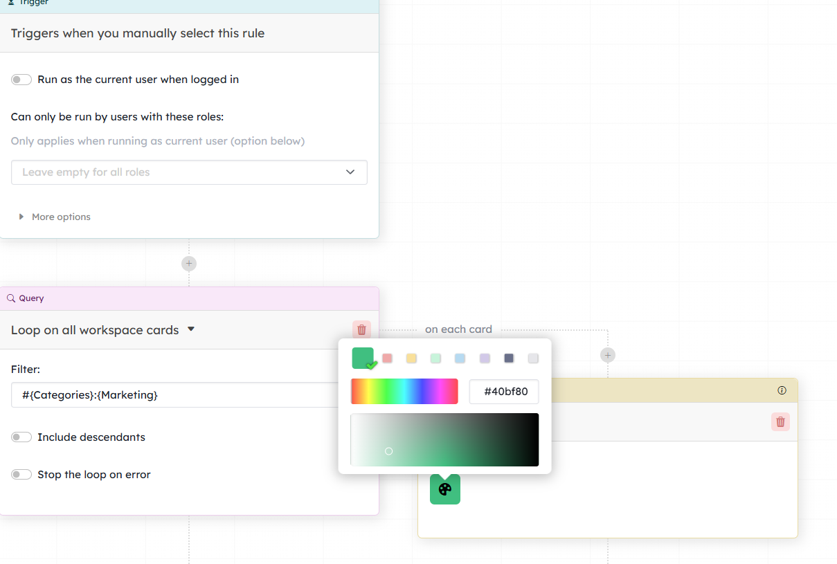
- This feature is also available via actions in the Automations menu — “Set card color”.
Card Template
✨ 2026 New Feature ✨
You can create a card template with fields pre-filled with values. This can be very useful for recurring cards such as tasks on certain activities — saving you time by eliminating manual entry for each card, and avoiding the need to create automations to handle field completion (assignment, categorization, etc.) when cards are created.
To use a card template, create a card by clicking “Card” from the creation shortcut at the top right of your screen, and select the template to use.
To configure a template, you can do so from:
- Workspace settings / Card templates
-
Card menu: “Save as template”
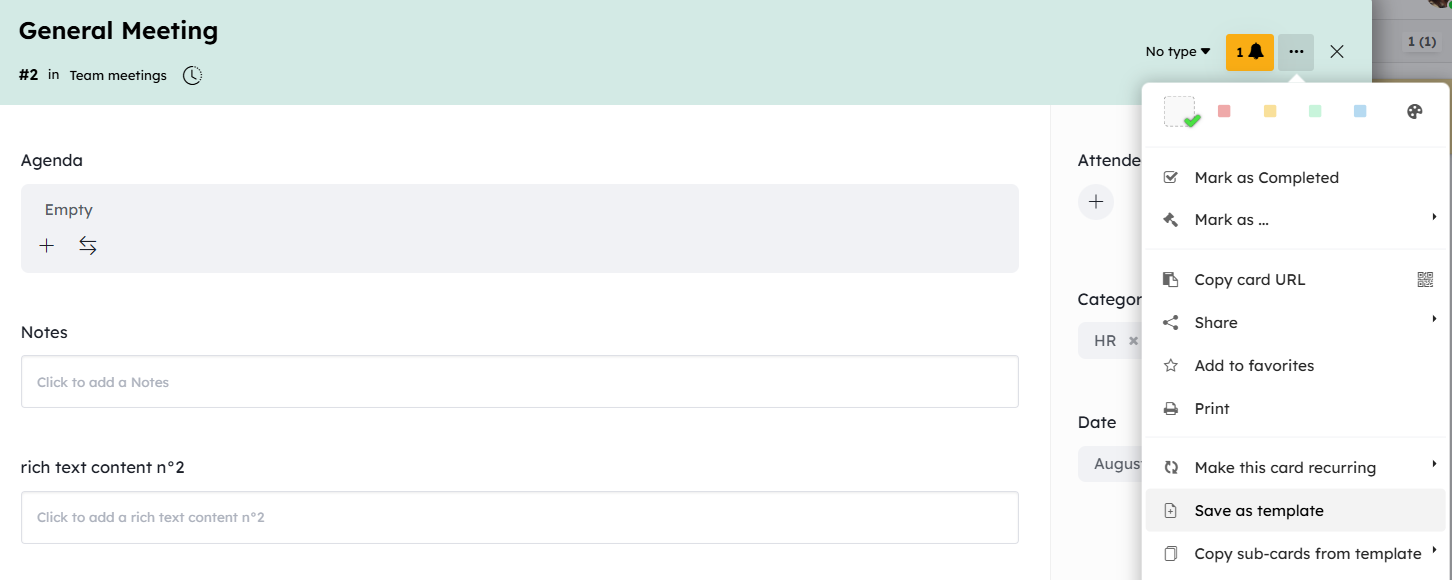
-
Creation shortcut at the top right of your screen: “Manage card templates”
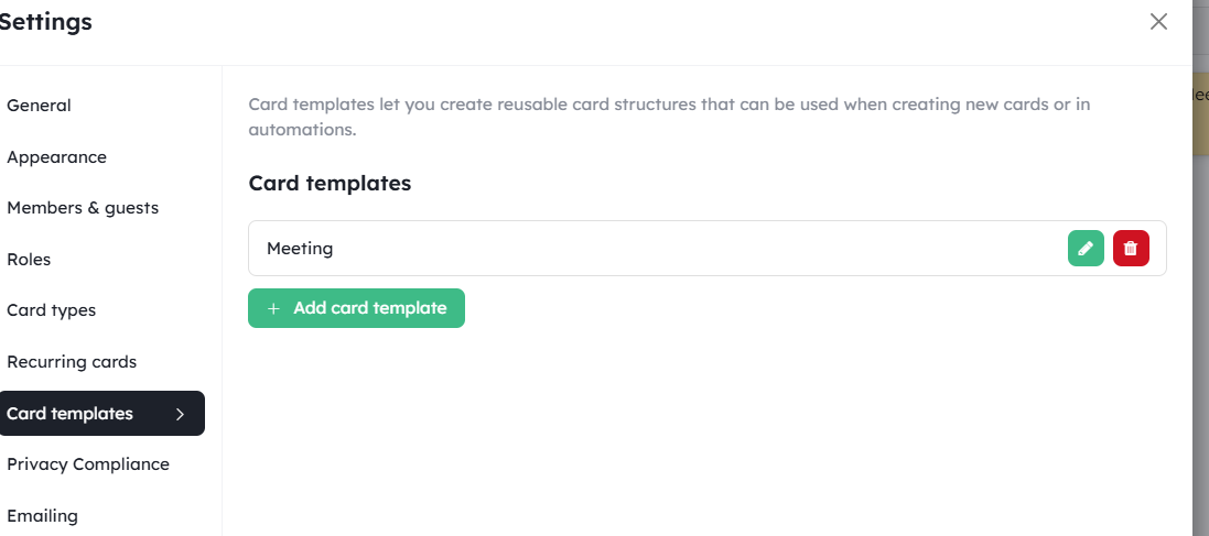
If you only want to reuse the sub-cards from a template, from a parent card you can use “Copy sub-cards from a template”.
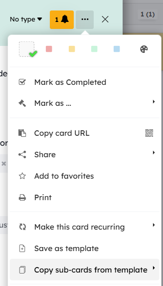
You can use card templates in automations via the “Create a card” or “Create a sub-card” action.
Card type and card template are two distinct features. It is therefore possible to create a card from a template while also using a card type (see next chapter).
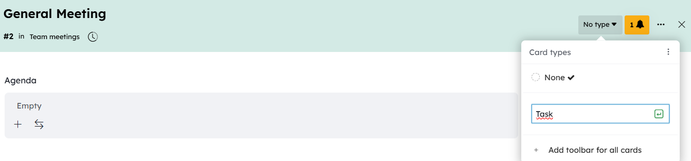
Card Types
Sometimes in a project, you may want to use cards representing different concepts and differentiate them visually. For example, in product management, cards can be either a feature or a bug.
To handle these different subjects within the same project, you can use Card Types.
They let you create different card types with their own color, their own icon, and their own collection of available fields (plus a few other options). Cards of that type will have access to this field collection in addition to the one shared by all cards in the project (as described earlier).
Adding Card Types to Your Project
Create a new type directly from your cards, using the card type selector.
The card will instantly take that type as its own, and if you add new fields to that card, they will in fact be added to that type and not to the collection shared by all project cards (unless you check the relevant option in the field addition menu).
You can also create types from the project settings menu under the Card Types section.
From this menu, you can share a card type with other workspaces in the same organization by clicking the share arrow icon. Each workspace administrator will then be able to enable this card type on their workspace (Workspace Settings).
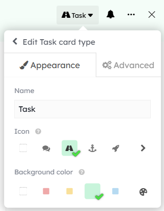
Editing a Card Type
Change the color and add an icon to your types directly in the menu by clicking the pencil icon.
Cards of that type will then share the same color and icon.

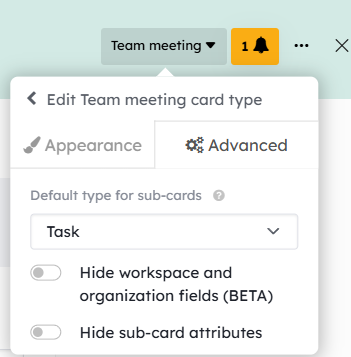
You can also define a default type for sub-cards of cards of this type. For example, “Meeting” cards will have “Task” sub-cards. To configure this, go to the Advanced Options of the card type.
Adding Fields Specific to a Card Type
When a card uses a type, fields created in that card will extend the type’s available field collection unless you uncheck the option.
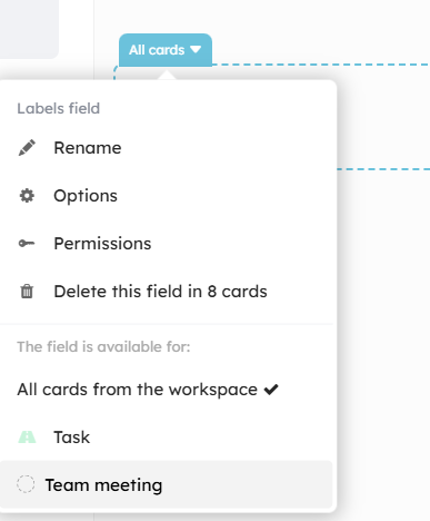
Only cards of that type will have access to this new field. A label above the field name indicates the card type, or “all cards” if the field is not associated with a type.
You can also add new fields to a type from the Project Settings under the Card Types tab.
Moving Fields Between Types
Fields can be moved whether or not they are associated with a type.
The position will be saved relative to other fields of the same type, and relative to fields shared by all cards in the project.
However, you cannot change the order of fields shared by all project cards just for a specific type — that change will be visible for all cards in the project.
You can move a field between two types. In doing so, all values of that field saved on your cards will be preserved — no data will be lost.
You can also move a field into the project’s field collection, making it available to all cards in the project.
To do this, click above the field name and select the destination card type.
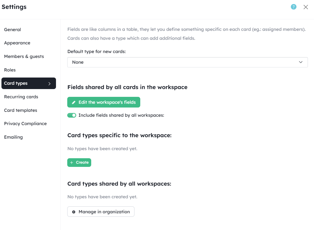
Organization Fields
You can define a collection of fields available for all cards across all projects in the team. This setting is found at the Organization settings level.
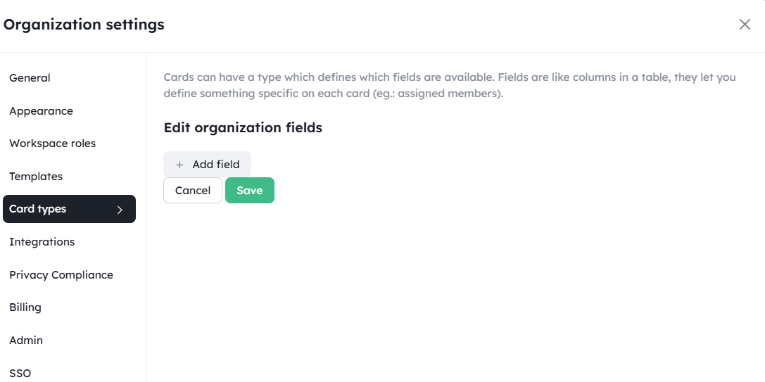
In each project, you can then decide whether to include these fields in your cards. You will find this option in the project settings under the Card Types tab.
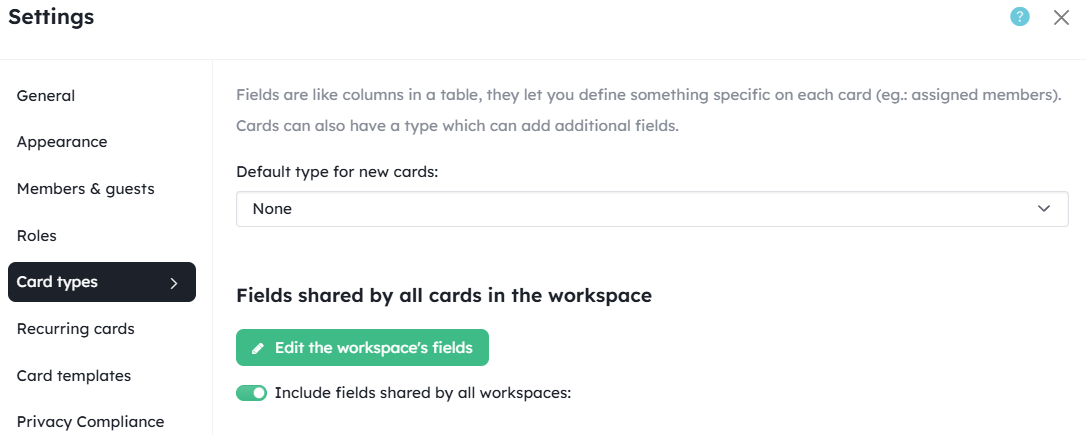
Organization fields cannot be reordered within your cards — they always appear at the top of the right column of your card.
Fields from External Services
Some external services (such as GitHub) add new fields to your cards once they are enabled in your projects.
These fields cannot be reordered within your cards — they appear at the bottom of the right column.
Please refer to the guide on Integrations with third-party services.