Timeline view
The Timeline is a project mode that lets you display and organize cards and groups on a timeline.
It is perfect for projects with deadlines or roadmaps.
For instance:
- organizing an event,
- launching a product,
- handling marketing campaigns,
- managing OKRs and strategic planning.
Basics
-
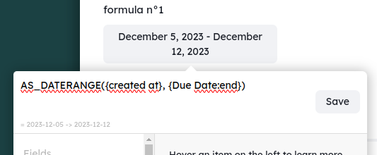
Select the date field you want to use. You can view the following types of fields:
- Date
- Look up of a date value (display the date of a date on the card of
another workspace) - Formula: only a date format so the result of a function as_date() or as_daterange() e x: as_daterange({created at};{due date:end})
- Select the
group byand thefilter -
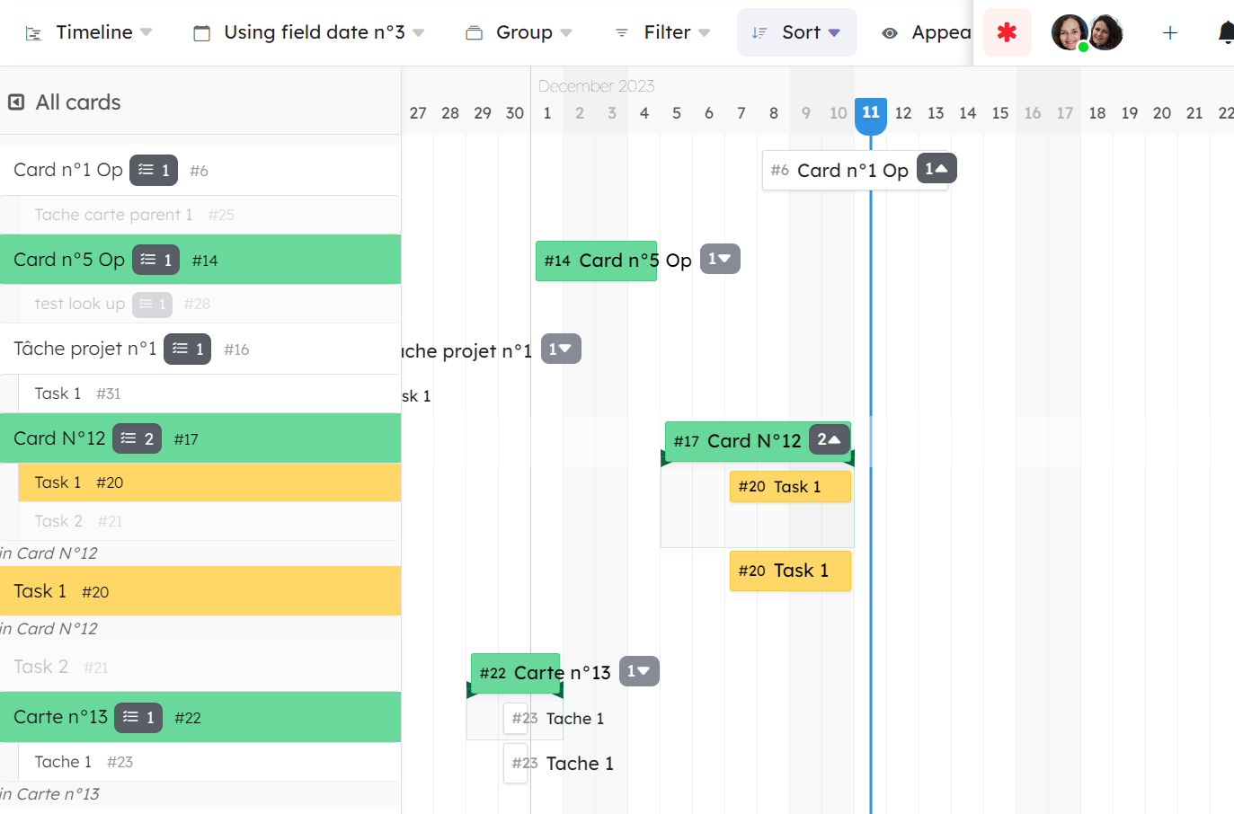
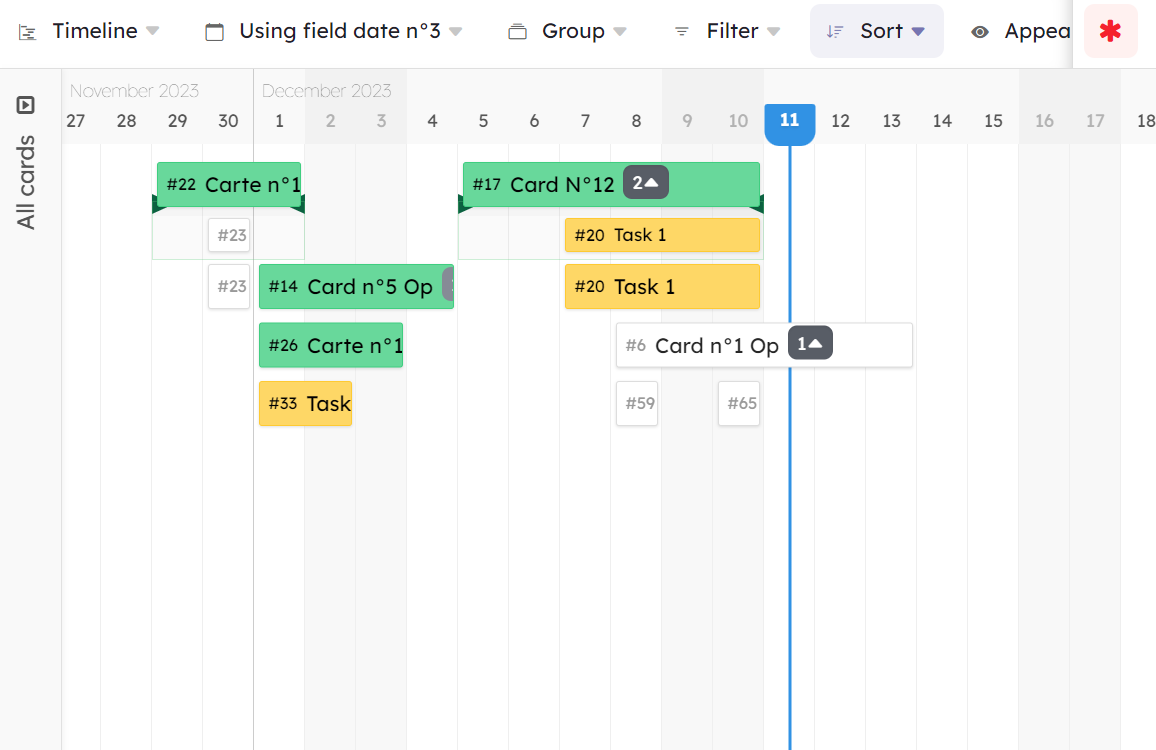
The default display mode shows you each card in their group in a side bar on the left side (even those that have no set dates) You can choose to fold the side bar and in this case the cards are positioned in the timeline from their start and end date. The display will automatically use as few lines as possible to display the cards. This compact mode is very useful if you want to know how many cards in this group are programmed at the same time.
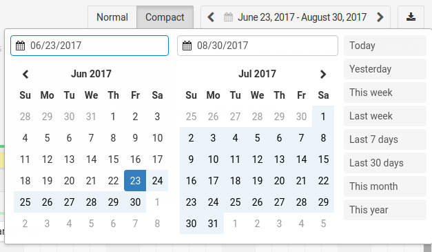
- Select the date range you want to see in your windows, you can select it as large as possible. The timeline grid is displaying smartly based on the selected dates range.
- Download you timeline as an image or get the iCalendar feed
- Cards are grouped by the selected
group by. - Click on a card (in the sidebar or in the timeline) to open it. Right click to open its context menu. Click on the small arrow (appearing on hover) to center the timeline around it.
- Drag the card on the timeline to change its daterange. Drag its left or right end to shorten or widen the range. If you shorten the card until it disapears, it will remove the daterange.
- To set a daterange on a card without one, click and drag (side bar mode)
Display sub-cards
On a card, you can click on the number of sub-cards to display/hide them.
If the date range of the sub-cards exceed the one of the parent card, a green bar will represent the complete period covered by these dates.
If you hide the sub-cards, this bar remains visible so that you will notice the sub-cards total date range.
This total date range is used in compact mode, instead of the card date.
Miscellaneous
Here are few other things worth knowing about timelines:
- You can’t reorder cards in groups by drag and drop.
- sub-cards are always ordered by their references.
- Cards that don’t have access to the current active date field are hidden. However, they are counted in the cards number displayed at the top of each group.
- Card mirrors are displayed only if their target have access to the current active date field.
- In compact mode sub cards of a card with no date, is still visible (as a fake card).
Gantt View
General Information
- The Gantt view is a new view available on workspaces (not available on the Portfolio space for now).
- Available with the Business and Enterprise plans.
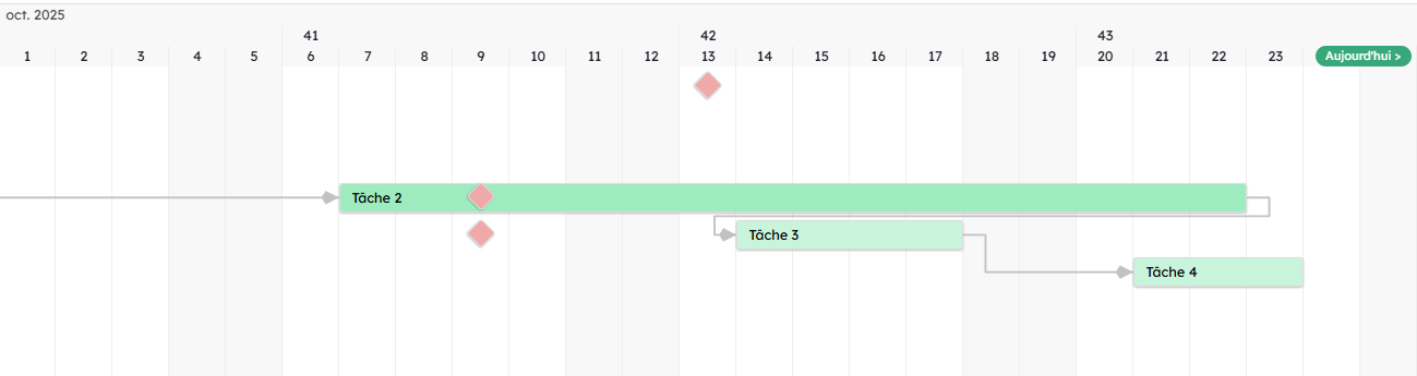
- The Gantt view requires the existence of a Card Relation field to work. This field allows you to create and display dependencies between your cards.
- You can move cards by dragging and dropping them directly in the view.
Activating the Gantt View on an Organization
For on-premise and private cloud hosting:
To activate the Gantt view, the server administrator must go to the organization settings, in Admin / Feature flags, and add gantt (no uppercase) to the list.
Make sure to press “enter” and then click “save” to validate the addition.
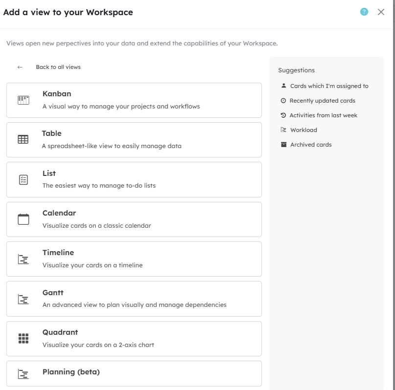
You should then see the new Gantt view appear in the “Add a view” menu on workspaces.
For Kantree Cloud hosting, this feature is available with the Business plan.

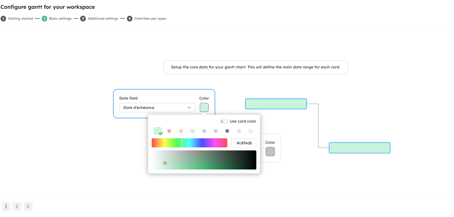
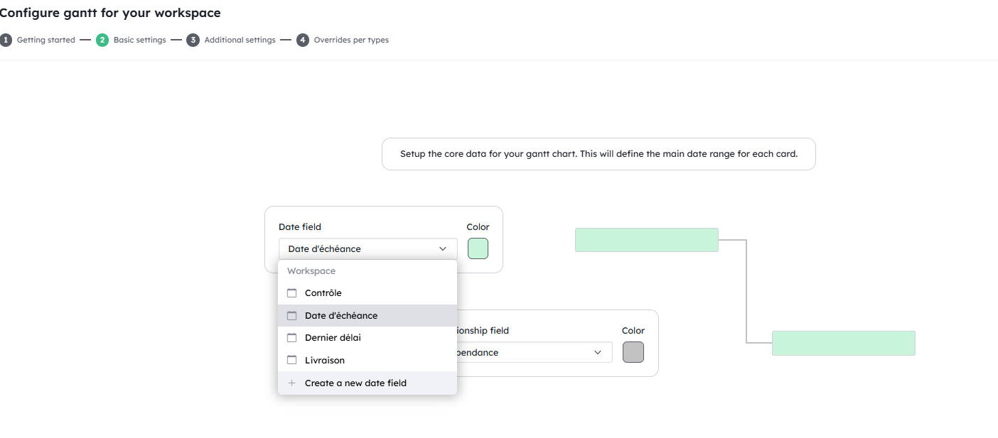
Configuring the Gantt View – Basic Settings – Date
-
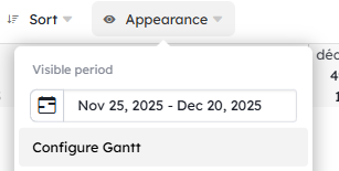
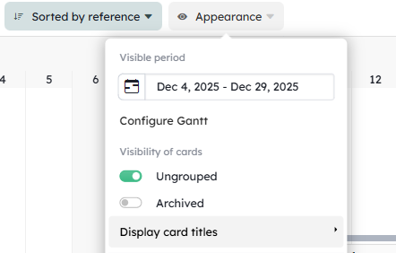
From the Appearance / Configure Gantt menu, choose the Date field to display and edit the display color of your cards.
-
From the Appearance / Configure Gantt menu, choose the Card Relation field
to display and edit the color of dependencies.
🆕✨ New in 2025
If you haven’t yet created your Date or Card Relation field, you can create it directly from the setup assistant.
Configuring the Gantt View – Basic Settings – Dependencies
Creating a dependency
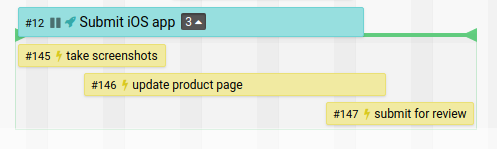
- To create a dependency link between cards, add a “Card Relation” field to your card.
- The dependency can be created from the card and its field or directly from the Gantt view.
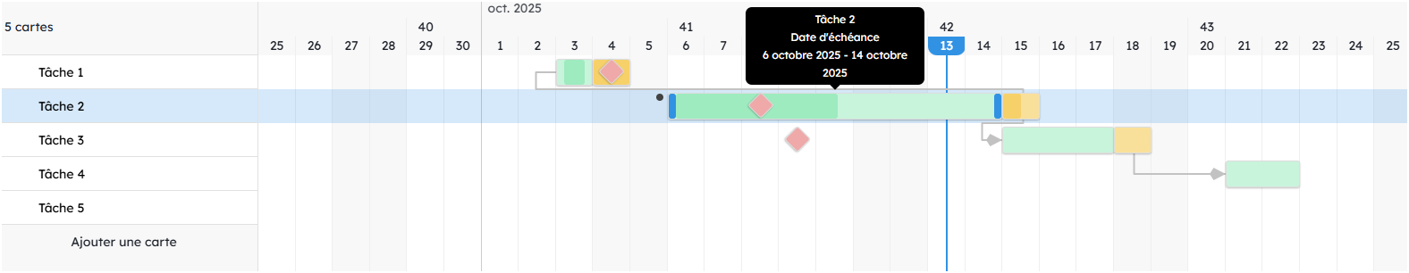
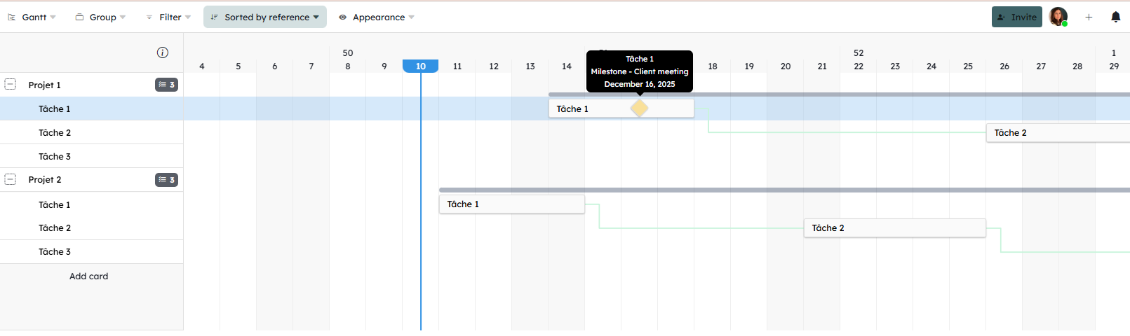
- The dependency appears as a line linking cards. You can create it from the card or from the view by stretching the line from a point to another card’s point.
- When creating a dependency from card A to card B, the value is written into card B (B depends on A).
- To delete a dependency, select the line, right-click, and choose “delete”.
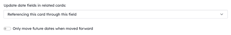
Automatic movement of cards based on dependencies
For dependent cards to move together when you change a Date field value on a card, you must activate the option in the Card Relation field: “Update date fields in related cards” and add “Referencing this card through this field”
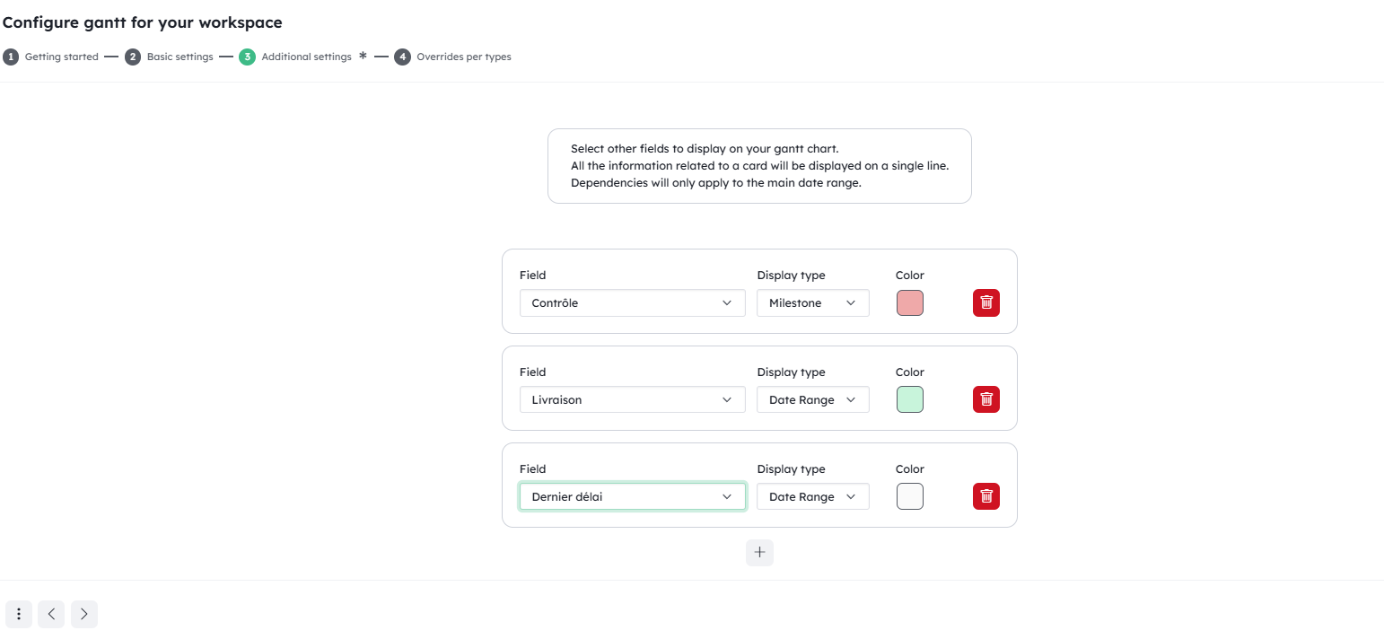
Configuring the Gantt View – Additional Settings – Multiple Dates
🆕✨ New in 2025
You can now display multiple Date fields (in addition to milestones) by going to Appearance / Configure Gantt / 3) Additional settings.
This allows you, for example, to display both a planned due date and an actual date on the same view.
If the Date field to display does not yet exist, you can create it from this window.
Here, you can choose whether it is a date range or a milestone.
All dates related to the same card are displayed on the same row.
Dependency visualization only applies to the Date field selected in the Basic Settings.
Configuring the Gantt View – Additional Settings – Milestones
- From the Appearance / Configure Gantt menu, you can add milestones based on different Date fields by selecting “milestone” instead of “date ranges.”
- You can add a milestone using a Date field shared across multiple cards or a field dedicated to a card used to describe a milestone.
-
Milestones appear as diamond shapes.
Display Options
Displaying card titles
🆕✨ New in 2025
You can display card titles inside the rectangles by going to Appearance / Display card titles / Inside the period.
Displaying a card’s progress percentage
🆕✨ New in 2025
If you use a Percentage field to display your card’s progress, this value appears as a colored progress bar inside the rectangle.

Critical path
Display the critical path by going to Appearance > “Display critical path.”
Cards that impact the project deadline appear in red.
Keyboard shortcuts
- space + drag (or shift + scroll wheel): move the page horizontally
- ctrl + scroll wheel: zoom in / out